29. 09. 2026
AI, NetEye, Unified Monitoring

A front end developer is positioned in the middle of lots of other jobs. To successfully deliver products he has to be aware of design, back end, content and other things that make everything nicely work together [2].
Misunderstandings, wasted time on synchronizing elements in development and production environments, duplicate work – these are just a few problems developers need to encounter developing a product [1].
Solving these problems would improve communication, knowledge distribution and provide consistency in the way the design process is being handled. This is where the Component Library comes in handy.
What is a Component?
Definition of “Component”
A part or element of a larger whole.
In the context of web design it is a part of user interface. Building Block. Reusable design solution for specific problem.
Characteristics of a component:
- reusable – works in any context
- could be composed from other components
- are aggregated to compose page [4]
- usually comes together with visual style
Component Library
Definition of “Component Library”
A collection of components, organized in a meaningful manner, and often (but not necessarily) providing some way to browse and preview those components and their associated assets.” [3]
Having the same knowledge base and mindset with colleagues (stakeholders, UI/UX designers, content writers, front end and back end developers) is a crucial part of component library implementation.
We’re not designing pages, we’re designing systems of components.
– Stephen Hay
Our Solution
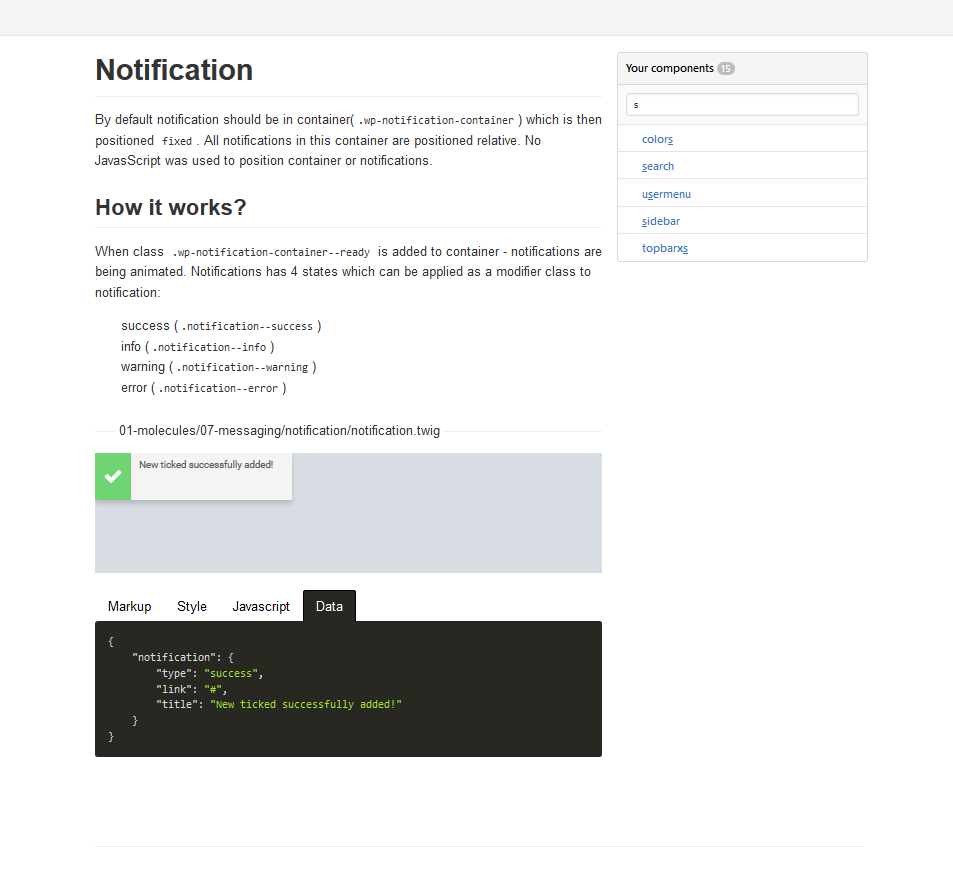
We were looking for a solution that could provide high flexibility. A solution that would
- have a nice overview about components in one place
- render component with demo data
- allow documenting components
- use multiple templating engines
- support general and product specific styles (to support legacy system)
- enhance front-end development speed.
The component library is written node.js. The installation and setup is as simple as cloning repository, setting location of components, choosing templating engine and launching npm install command in terminal.
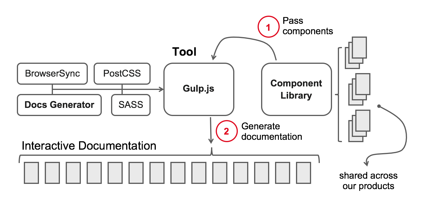
Components must contain at least one templating file.
The component then can be supplemented with
- demo data (
.json) - style (
.scss) - documentation (
.md) - javascript (
.js)
On any changes, new files are created – preview is generated.
Conclusions
By introducing a Component Library into our work-flow we are now able to follow up our product evolution and to ensure style consistency across all our products. We have established our own vocabulary in our team when we talk about design implementation which reduces the misunderstandings and enhances the speed and quality of design implementation.
[1]: http://www.slideshare.net/WolfBruening/how-to-build-the-perfect-pattern-libraryy “Wolf Bruening slides”
[2]: https://css-tricks.com/front-end-developer-aware/ “A Front End Developer is Aware”
[3]: http://clearleft.com/thinks/382 “On Building Component Libraries”
[4]: https://articles.uie.com/components_vs_patterns/ “Components Versus Patterns “

Karlis Upitis
Front End developer | Design Systems
Author

Latest posts by Karlis Upitis
24. 08. 2018
Icinga News, NetEye
Introducing Lampo Module-Wide Quick Navigation
24. 08. 2018
Service Management
Images in EriZone notification emails