22. 05. 2026
NetEye, NetEye Extension Packs

31. 12. 2024
Rocco Pezzani
Business Service Monitoring, ITOA, NetEye, SLM, Unified Monitoring
Display a Service’s Availability with ITOA
This is that Time of the Year when you begin preparing all your SLA Reports to help you understand how your important services behaved during the year itself. It’s like the end of a horse race, when the bets are settled and you realize whether the bets you placed were right or not.
And since I don’t like bet too much… if you manage a service that’s critical/strategic to your company, you should check its reliability throughout the year to understand if you need to take action to improve it. So I was wondering, how exactly can I do that?
Continuous SLA Reports
Since NetEye comes with the Icingaweb2 Reporting Module out of the box, a very basic idea is to run and analyze SLA Reports more frequently: two or three times per year (in addition to the final one) might help you understand what happened. But this will always be just a review, allowing you to see only what already happened.
Running SLA Reports more frequently, with a shorter time frame, can help in identifying subtle service interruptions before they significantly impact your SLA; it can also help you plan maintenance without degrading the End User Experience too much: in other words, “my service is acting up this month, so I must reschedule low-priority maintenance later”, or the opposite (pre-empt it if everything is going well). This is starting to be more prevention than review, and I like it.
To accomplish that, the naivest idea is to run and analyze all your SLA Reports more often, but that’s still a review, and a time consuming activity at that. I need something easier to look at and understand. Maybe an ITOA Dashboard is a better idea: sure, a Timeline with some green/red marks is better than a report with a list of outages, but querying Icinga Event History for all events every time a Dashboard changes is really costly for a system, especially when you need to scale up.
Sadly, MariaDB and the Icinga 2 IDO Data Model are not really cut out for this kind work, and Grafana is insensitive to this matter. There’s a risk of overloading the Database Backend, resulting in a poor user experience for all NetEye users. Nevertheless, this is the right path to start walking down.
Availability through InfluxDB and Grafana
So I began to look for an alternative method, maybe using InfluxDB as the backend: InfluxDB is a better choice for this kind of work, and together with Grafana they make a great couple. Then, I suddenly remembered that Icinga 2 can send also some interesting metadata to InfluxDB alongside performance data:
- Check Latency and Execution Time
- Acknowledgement and Downtime state
- Number of Check attempts
- An object’s Reachability
- An object’s Current Status value and type
There is everything we need to build an ITOA Version of an SLA Report, but we have to activate it (it’s disabled by default). To activate it, edit the file /neteye/shared/icinga2/conf/icinga2/features-enabled/influxdb.conf, add the property enable_send_metadata, and set it to true. Here’s an example of what the configuration file should look like after editing.
/**
 * The InfluxdbWriter type writes check result metrics and
 * performance data to an InfluxDB HTTP API
 */

library "perfdata"

object InfluxdbWriter "influxdb" {
    host = "influxdb.neteyelocal"
    port = 8086
    ssl_enable = true
        username = "influxdbwriter"
        password = <PASSWORD>
    database = "icinga2"
    flush_threshold = 1024
    flush_interval = 10s
    host_template = {
        measurement = "$host.check_command$"
        tags = {
            hostname = "$host.name$"
        }
    }
    service_template = {
        measurement = "$service.check_command$"
        tags = {
        hostname = "$host.name$"
            service = "$service.name$"
        }
    }

    enable_send_metadata = true
}
Now you can restart the Icinga 2 Master Service, and Icinga 2 will store the required metadata alongside performance data within InfluxDB every time a check is executed. The downside is that disk space consumption and the cardinality of InfluxDB will increase, but that’s nothing we can’t handle (usually).
To get more insights, look at Icinga 2 InfluxDB Writer Documentation.
Considerations about Precision and SLA
Although data written in InfluxDB has the highest possible accuracy, InfluxDB and Grafana are tools for approximation, so some loss of accuracy is to be expected. Furthermore, there’s no room for Event Correction: after data is sent to InfluxDB, it should be considered immutable by normal means, so updating data already stored should not be considered as feasible.
While you might think this is a bit sad, please remember our original purpose. We’re not trying to replace the Icinga Web 2 Reporting Module or the NetEye SLM Module. We’re trying to create a tool that will allow us to take action before our SLA is irreparably affected by the current state. The precise calculations are still in the domain of the NetEye Reporting Modules.
Query InfluxDB to get Availability Data
Now we can query InfluxDB for availability data. For now though, let’s stick to the Real State, without worrying about Acknowledgements or Downtimes.
The Status of a Host/Service is stored in the same Measurement used for its performance data, in the field state. This field is numeric and contains the very same state returned by the monitoring plugin used (its return value), so you must remember that querying for Host Availability is slightly different than querying for Service Availability, as described in the table below. In this blog post, we’ll concentrate on service availability.
| State value | Host Status | Host Availability | Service Status | Service Availability |
|---|---|---|---|---|
0 |
UP | Available | OK | Available |
1 |
DOWN | Unavailable | WARNING | |
2 |
DOWN | CRITICAL | Unavailable | |
3 |
UNKNOWN | UNKNOWN |
To draw a Time Line, we can use the State timeline panel. The query is simple: we need to select the field state from the right measurement. But what about the Aggregation Operator? The issue is shown int the next image.
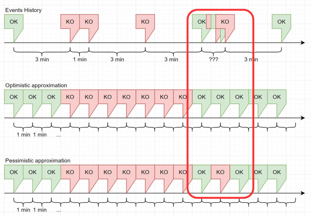
Data returned from InfluxDB to Grafana is grouped by a specific Time Interval. Since for a normal service the value for Check Interval is 3 minutes and Retry Interval is 1 minute, we should use a time interval of 1 minute or less, and missing points should be filled with previous value to avoid gaps.
The left part of the image represents this situation, but it’s really optimistic. You should know that the Icinga 2 Scheduler is not precise enough to guarantee a point every Check Interval/Retry Interval. Also, an operator might click on the Check Now button, or a passive check might be triggered multiple times within a few seconds. This may result in multiple points within the same Time Interval, as represented in the right part of the image.
Also, if a range of several days or weeks is selected in the dashboard’s Time Browser, the time interval can easily grow to 1 hour or more. Therefore, we must decide how handle multiple points in the same time interval.
Optimistic and Pessimistic Groupings
Since an Object State is an integer, we should not let InfluxDB return the mean value of all points in the time interval: i.e., which state corresponds to 1.8? Is it a Critical or a Warning? So rounding is not permitted regardless of the type of rounding used (floor or ceiling).
The only viable solution is to pick one value from the time interval and plot it. If we pick the maximum value, we plot the worst state that occurred, and if we pick the minimum we plot the best one. Which should we choose?
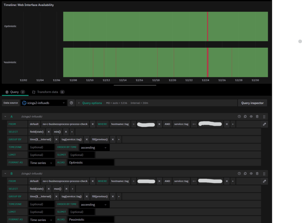
In my humble opinion, I think we should plot both: two separate time lines, one with the best states and one with the worst states. And so our Real Availability will be something in the middle. As you can see in the image below, with a time window of 30 days and a time interval of 30 minutes, we had only one major outage, visible in both time lines, and several minor outages, visible only because we’re looking for the worst states.
This way we can easily spot the points where we want to zoom in and see more details, while knowing that with this time resolution, everything went pretty much fine. Remember that this can also happen with narrower time windows: based on the frequency, the state of an object changes, and approximations will hide what truly happened.
Now, you can easily say “Okay, let’s only plot the worst cases”. Then I can reply “Okay, if your service changes state fast enough (or if you zoom out enough) all you’ll see is a completely red bar”, which is completely useless.
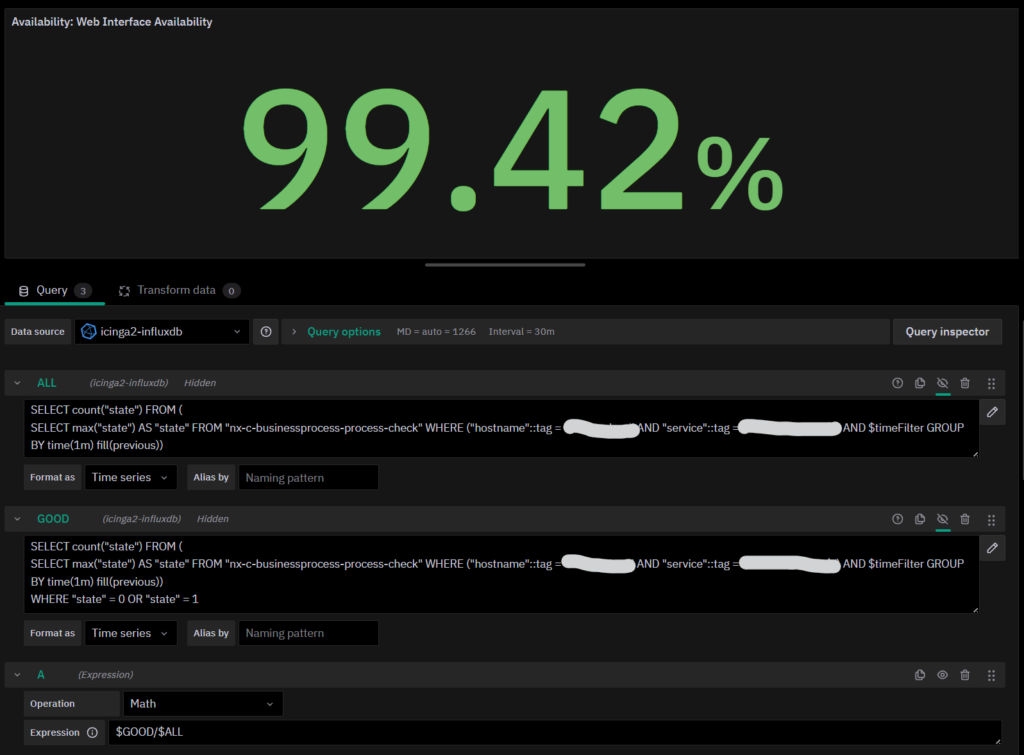
Availability Percentage
The calculation of Availability Percentage is a slightly different matter. First of all, what is availability? In its simplest form, it’s the ratio of time a service is available compared to the total amount of time. Since calculating the amount of time spent in a time-based query is a bit too difficult, we should remove the concept of time itself and use grouping.
If you look at the image of the Time Line Approximation, you’ll notice that in line two and three, for each time interval we have a single value. Therefore, counting the number of times a specific value appears and dividing it by the count of all returned values will do the trick. Even without knowing anything about the size of the Time Window.
Since we have to display a single value, we don’t really care about the time interval Grafana proposes for the grouping: we can set it to a value of our liking. In this specific case, we used 1 minute, but if you want a more accurate value, you can go even further down to 30 seconds or 10 seconds, but remember one important thing: the lower the Time Interval, the higher the number of points InfluxDB has to handle, resulting in poorer dashboard performance. So keep in mind what’s the typical time window you expect to use, and test the resulting performance accordingly.
Okay then, let’s start by counting all values in the time window:
SELECT count("state")
FROM (
	SELECT max("state") AS "state"
	FROM "nx-c-businessprocess-process-check"
	WHERE
		("hostname"::tag = 'HOST_NAME' AND "service"::tag = 'SERVICE_NAME')
		AND $timeFilter
	GROUP BY time(1m)
	fill(previous)
)
We have a Nested Query made up of two queries. The Inner Query is the same as the pessimistic timeline with one small adjustment: the GROUP BY time clause changes from time($__interval) to time(1m), ensuring we have a 1-minute-resolution for the state calculation. The Outer one is just a simple COUNT. To make COUNT work, we simply added an ALIAS for the single field returned by the Inner Query.
Now let’s continue by counting how many time intervals have the Available state (which translates to values 0 and 1 for a service:
SELECT count("state")
FROM (
	SELECT max("state") AS "state"
	FROM "nx-c-businessprocess-process-check"
	WHERE
		("hostname"::tag = 'HOST_NAME' AND "service"::tag = 'SERVICE_NAME')
		AND $timeFilter
	GROUP BY time(1m)
	fill(previous)
)
WHERE "state" = 0 OR "state" = 1
Easy-peasy: just add a WHERE clause that keeps only those values we’re interested in.
To calculate the actual availability, we just need to use a Grafana Expression to get the ratio between the two queries, and that’s all. To display this number, you can use a Stat panel (remember to hide the two queries, leaving only the Expression visible):
The Final Result
By assembling both the Timeline and the Stat panels and adding a simple Stat to show the Latest Service’s Status, we have an ITOA Dashboard with a neat layout that’s easy to understand.
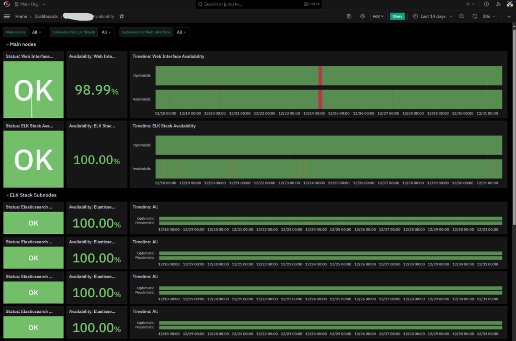
In this Dashboard we have the status of several services that are actually monitoring one Business Process each, but you can use this logic to perform Availability calculation on a simple service, if you need to do so.
Using the Time Picker provided by Grafana, you can have a rough calculation of Availability in a time window of your choice and at the same time see some points of interest that you can zoom in to get more insights.
In the future, we’ll proceed to integrate Acknowledgement and Downtimes in the logic of this Dashboard, and of course provide you with some useful suggestions about how to do the same.
Happy New Year, and Happy SLA Reporting!
These Solutions are Engineered by Humans
Did you find this article interesting? Does it match your skill set? Our customers often present us with problems that need customized solutions. In fact, we’re currently hiring for roles just like this and others here at Würth Phoenix.
Author
Latest posts by Rocco Pezzani
22. 05. 2026
NetEye, NetEye Extension Packs
NEP and Upgrading to NetEye 4.48
18. 03. 2025
Icinga Web 2, ITOA, NetEye, UI, Unified Monitoring
A First Step towards Multitenancy in Icinga 2
30. 11. 2024
Business Service Monitoring, NetEye, Unified Monitoring
The Story of a Strange Business Process