
10. 07. 2026
Daniele Saccon
APM, Log Management, Log-SIEM
Creating Powerful and Effective Dashboards: Tips and Best Practices
Why Dashboards Are Important
In the modern IT world, simply collecting data isn’t enough: Real value comes when data can be quickly interpreted and transformed into useful information.
Dashboards represent the final step of a process that starts with:
- Data collection
- Data import into the platform
- Analysis and processing
Through charts, tables and interactive visualizations, dashboards allow users to:
- Easily and quickly consult real-time data
- Have an immediate and centralized overview of services and infrastructure status
- Improve data understanding and support decision-making
One of the main advantages of dashboards is the ability to quickly move from a general overview to technical details. For example, you can immediately identify a degraded service or anomalous behavior and then further investigate through logs, metrics and correlated events.
Dashboards are thus not just graphical tools, but operational tools that help users understand data, speed up analysis and support decisions. In platforms such as Kibana and NetEye, they represent one of the most important elements for making collected data truly useful.
Tips for Creating Effective Dashboards in Kibana
An effective dashboard should not only look visually appealing, but above all be clear, useful and easy to consult. The main goal is to help users quickly understand the status of systems and identify possible issues.
When creating a dashboard, it’s important to combine different types of visualizations, each of which has a specific purpose.
Create a Dashboard
First, go to the dashboard section in Kibana:
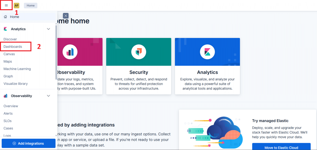
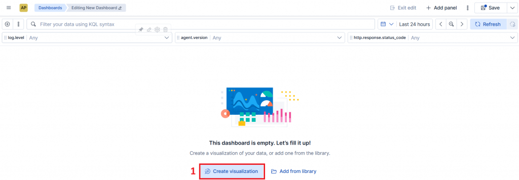
and click on “Create a dashboard”:
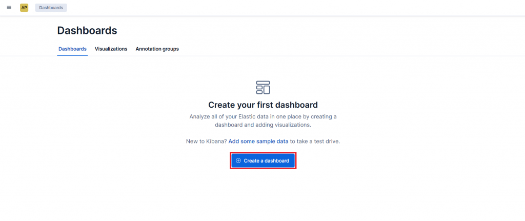
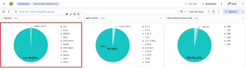
At this point, we can start inserting our charts:
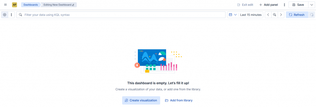
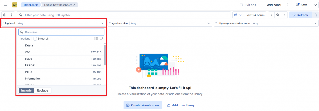
Using Controls
Controls are extremely useful because they allow users to dynamically filter data directly from the dashboard. This allows a single dashboard to be reused in many different scenarios without the need to create separate views.
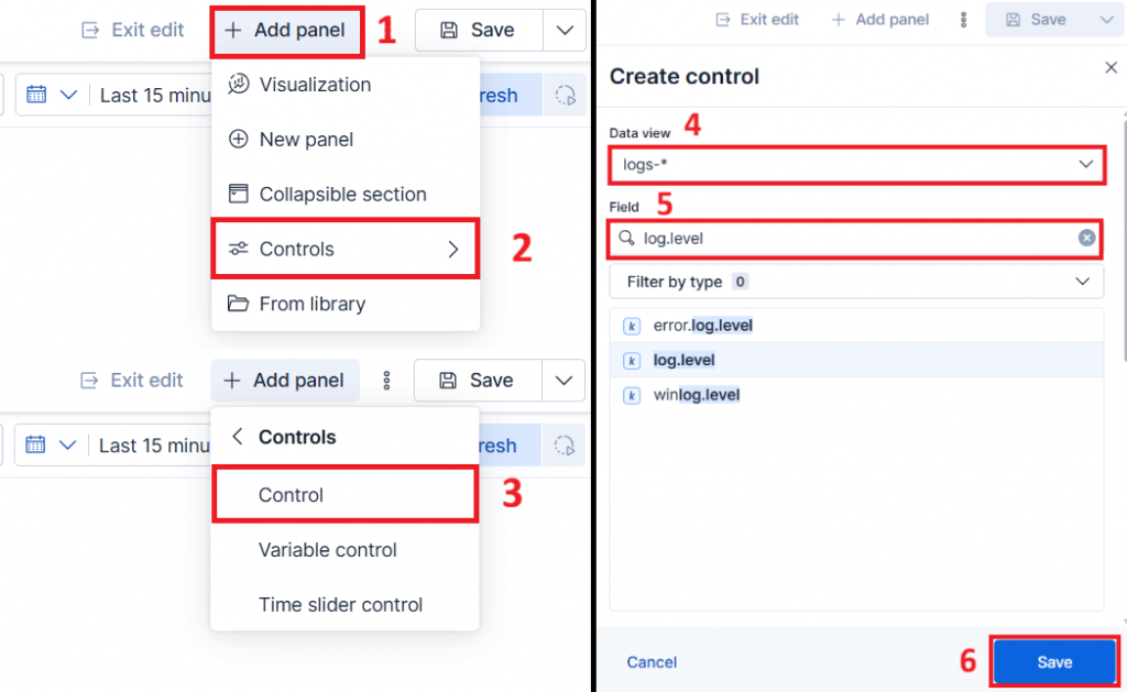
Controls greatly improve interactivity and make navigation simpler and faster.
Using Pie Charts for Status or Top N
Pie charts are useful for representing distributions and proportions.
They are particularly effective for:
- Displaying OK/WARNING/CRITICAL states as “traffic lights”
- Showing Top N values
- Highlighting the most active hosts
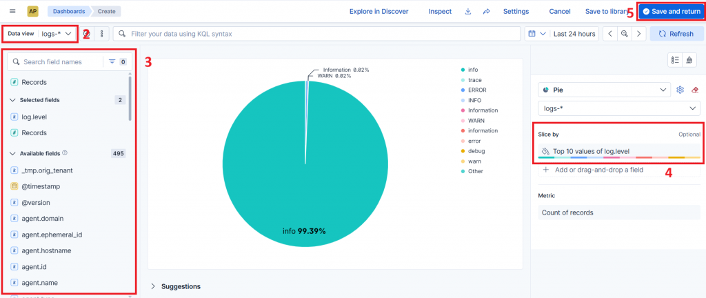
However, they shouldn’t be overused: Too many slices make the chart difficult to read.
In general, pie charts work best with a limited number of clearly distinct values.
Line or Bar Charts for Time-Based Analysis
To visualize data trends over time, the best chart types are:
- Line charts
- Area charts
- Bar charts
These charts allow users to:
- Identify trends, increases or sudden drops
- Observe peaks
- Compare time periods
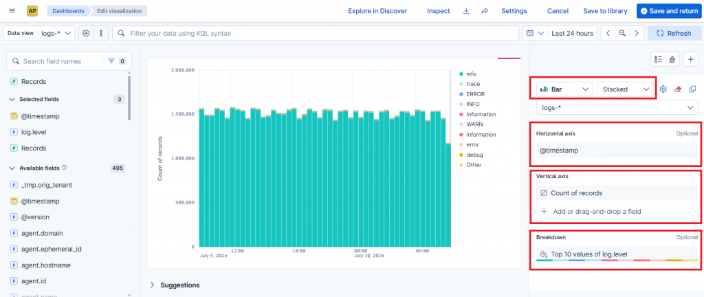
Line charts are generally better suited for continuous metrics, while bar charts work well for counts and aggregated events.
Highlighting Important KPIs
A good dashboard should immediately display the most important information.
For this reason, it’s useful to include:
- Single metrics
- Counters
- Color-based indicators
- Status panels
For example:
- Number of critical alerts
- Offline systems
- Average resource usage
- Available services
The most important information should be visible immediately and at a glance.
Using Colors Consistently
Colors help users quickly interpret data.
For example:
- Green → OK
- Yellow → warning
- Red → critical
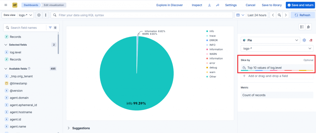
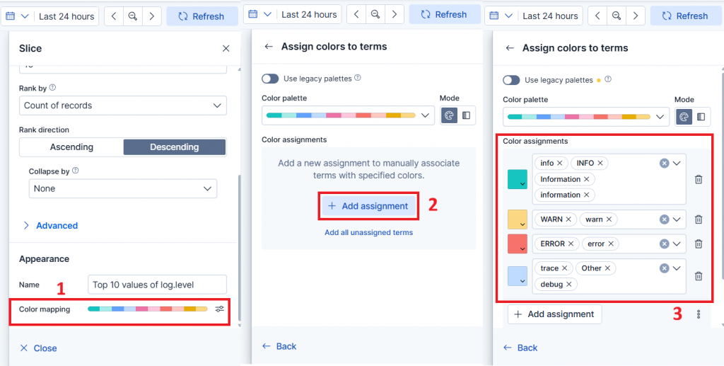
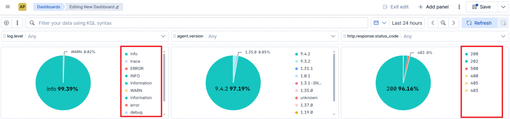
It’s important to maintain consistency across all visualizations to avoid confusion.
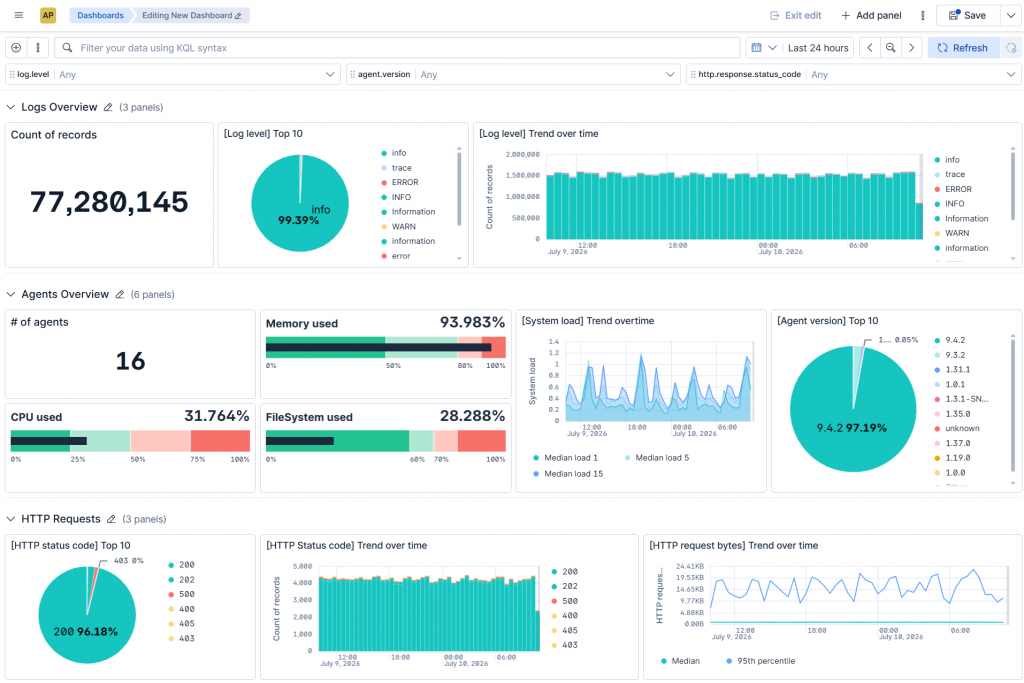
Organizing Panels Properly
Panel order is very important. Good practice includes having:
- Division of graphics into sections
- Main KPIs at the top or left
- Time-based charts in the center
- Technical details at the bottom
This helps users first get a general overview, and then progressively explore more detailed information.
I also recommended avoiding overly crowded or confusing dashboards.
Conclusions
Dashboards are not just graphical tools, but one of the best ways to truly give value to your data and transform it into useful information for everyday activities.
Having a clear and effective dashboard allows you to immediately understand what’s happening in your systems, quickly identify potential issues, and always keep your services under control.
With tools such as Kibana and NetEye, creating personalized dashboards is simple and allows you to adapt them to your needs, making data much more readable, immediate and easy to consult.
Experimenting with different charts, filters and visualizations is often the best way to discover new insights about your systems and build dashboards that become increasingly useful for day-to-day operations.
These Solutions are Engineered by Humans
Are you passionate about performance metrics or other modern IT challenges? Do you have the experience to drive solutions like the one above? Our customers often present us with problems that need customized solutions. In fact, we’re currently hiring for roles just like this as well as other roles here at Würth IT Italy.

Daniele Saccon
My journey in the world of IT began in the area of Data Analytics and Big Data, where I worked with a different tools, with a particular focus on Elastic Stack. Over time, my interests shifted toward Application Performance Monitoring and Observability, which now represent the core of my professional activity. I am passionate about making systems and data more readable, interpretable, and useful, in order to help customers make better decisions and gain an increasingly clear view of their technological environments.
At Würth IT Italy, I am part of the NetEye Delivery team, where I support customers on projects related to APM and Observability. What motivates me most is working across different contexts and having the opportunity to combine technical expertise with a consulting approach, building practical solutions that deliver real value.
Author

Latest posts by Daniele Saccon
16. 03. 2026
APM, Knowledge Management, Log-SIEM, Training
Inside Elastic Certifications: My Experience Between Preparation and Exams