10. 07. 2026
APM, Log Management, Log-SIEM

29. 03. 2022
Davide Sbetti
Machine Learning, NetEye
Data Exploration in Kibana: from a Simple Visualization to Anomaly Detection
These days we live in a data-driven world, where the collection and analysis of data empowers not only companies but also individuals to plan future actions based on the information that is extracted. NetEye enables both the collection and analysis of an enormous amount of data using various platforms, such as Kibana, for data written to Elasticsearch.
But how can we present and analyze the collected data in order to extract useful information? In general, there are different tools and options available, with visualizations being a rather simple but powerful approach to obtain information at a glance.
The Kibana interface, available in NetEye, offers under its Machine Learning section a simple yet capable Data Visualizer tool, which can help us create these visualizations.
In this article, we will explore how we can use it to create effective visualizations that can provide us with some useful insights. Moreover, we will apply some machine learning jobs in order to confirm the intuitions derived from our interpretation of the developed charts.
To start our analysis, let’s import some test data, such as the Sample web logs, which we can import from Kibana’s homepage by clicking on the Try sample data button.
Data Exploration
After importing the sample data, let’s explore it by using the Data Visualizer: in the Kibana menu we can click on Machine learning, then on Data Visualizer and lastly on Select an index pattern. From here we can select the index that was automatically imported when we added the sample data, called kibana_sample_data_logs. The resulting screen will resemble the following:
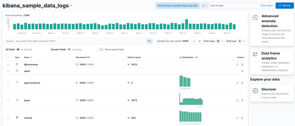
At the top, a chart provides us with an overview of the number of documents (in our case requests) we have in the specified interval, adjustable using the date picker available at the top right (in this case the interval was set to the last 30 days). Next, a summary of all the available fields for each request is available, along with the distinct value count and an overview of the distribution of the data.
Quickly inspecting the available fields, we can observe how some of them can already help us create a simple visualization as a first analysis, namely the timestamp of the request and the clientip, which allows us to break down the requests per client. Let’s start with a first simple visualization: the overall number of requests per day. In order to create such a visualization, we can exploit the timestamp field, by clicking on the next-to-last action button in the timestamp row, called Explore in Lens.
Kibana’s Lens editor will then open, already suggesting a chart:
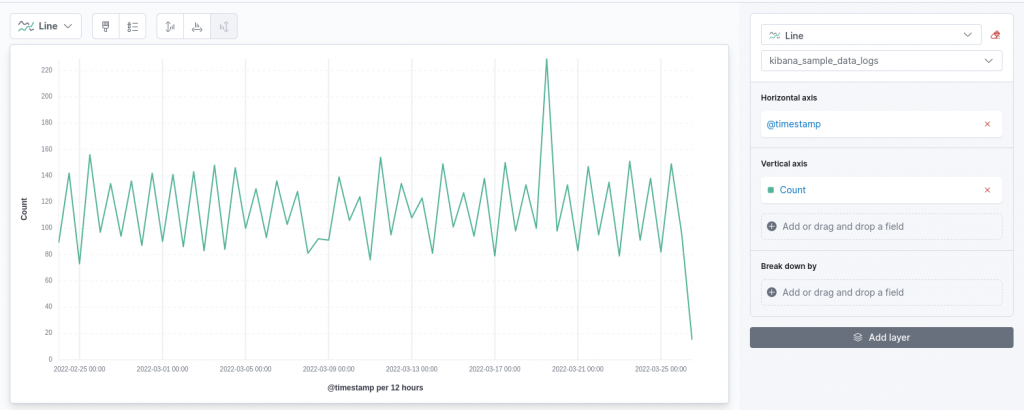
In the proposed chart, the timestamp is shown on the X-axis against the count of the requests shown on the Y-axis. This resembles the structure of the first visualization we want to produce! However, by default, Lens has decided to show us the number of requests, breaking them up into 12-hours intervals. We can refine this to an entire day, which smooths the resulting curve.
On the right configuration panel, a click on the field we are visualizing on the horizontal axis, namely @timestamp, enables us to customize its parameters. For instance, we can customize the time interval to a full day, as follows:
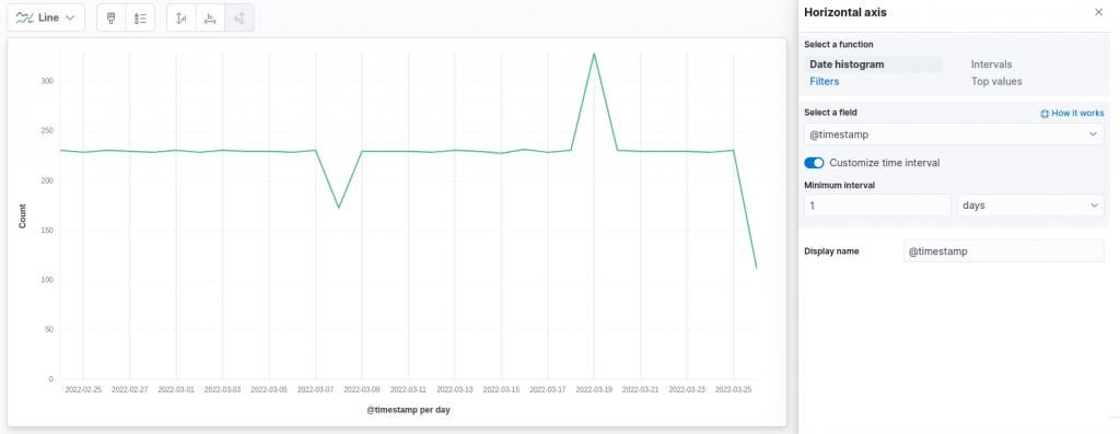
Clearly, the interval we choose in real world scenarios depends highly on the number of documents we are collecting and on the specific use case. However, in our case such an interval clearly highlights how the number of requests follows a really quite constant trend over the last 30 days, except for two particular days, information that could have been more difficult to discover with a finer granularity on the time axis.
Before we investigate those two “outlying” days, could we add some further information to this chart? Well, perhaps we can incorporate the information related to the client who’s making more requests every day. To do so, we can add a layer to the existing chart, using the dedicated button in the right configuration panel. Adding a new layer requires us to specify, as already done for the first one, which fields should be used on the two axes. In our case, we would like the X-axis to be equivalent in both layers, therefore we will configure it again using the @timestamp field with a granularity of 1 day.
The Y-axis will also be equivalent to the previous chart, namely we will use the count of records. This time, however, we will enable the Break down by option, which allows us to break out the count by clientip, showing only the top value and without grouping other values in a dedicated groups, since we are interested only in the largest value:
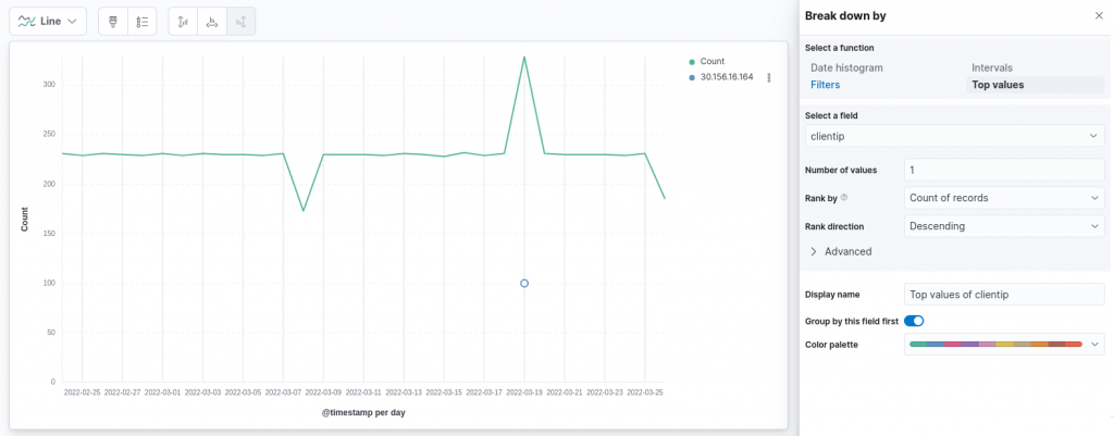
From the chart above we can note something interesting: on only one day do we have a significant result that was shown on the map with the adopted scale, namely on the day in which the number of requests was much larger compared to the usual behavior. Our intuition in this case can clearly be to identify this as an anomaly, including the strangely large number of requests made by a single client (100 requests), something that was unusual. Can we provide some evidence of this anomaly?
Anomaly Detection using Kibana
NetEye, through Kibana, can run machine learning jobs on data stored in Elasticsearch. One type of such a job is an anomaly detection job, which, as reported in the official documentation, adopts standard techniques to model the normal behavior of a time series, namely a sequence of data points related to a time attribute. Such techniques generally include the identification of properties like stationarity (checking that the mean and variance of the series remain constant over time), long-term movements (trends) and regularly repeating patterns (seasonality). We can easily exploit all these techniques since they are already embedded in the available anomaly detection jobs.
The first job we can build ensures that the spikes we found at the 1-day level of granularity are proven to be anomalies. To do so, we can create, under the machine learning section of Kibana, an anomaly detection job based on the index we used to visualize the data. Various wizards help us in configuring the job, based on the number of metrics we would like to consider. In our case, a single metric can be considered for this first job, namely the count of events. For this reason, we can configure a single metric job on the count metric. The bucket used for the analysis, namely the considered interval, can be automatically estimated by the tool. However, in our case, since we are interested in 1 day results, we can force it to adhere to our view of the problem. All remaining settings can be left to their default values, thus resulting in the following configuration:
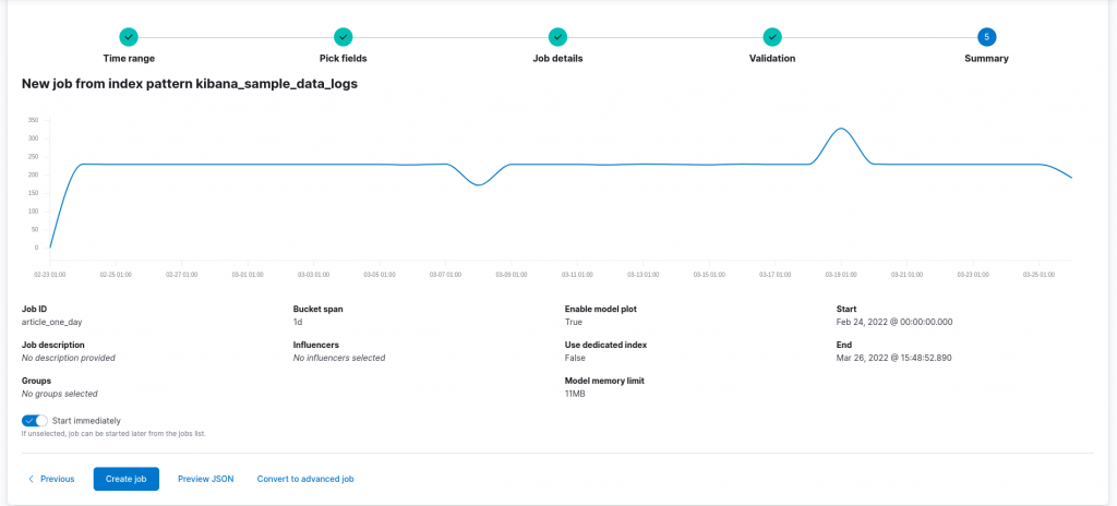
Running the resulting configuration returns us the following results:
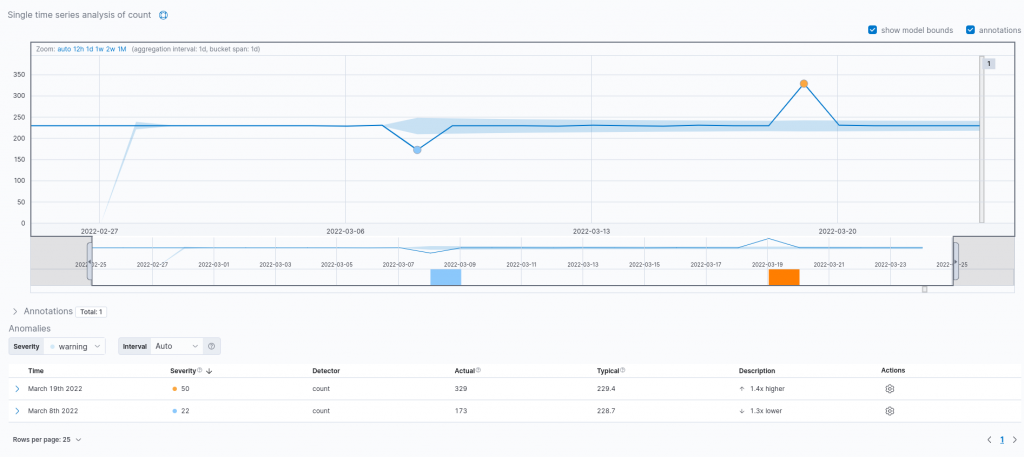
As we can see from the results obtained, both spikes are actually recognized as anomalies confirming our intuition. Moreover, the tool reports the actual event count along with the expected one, based on the typical behavior of the time series and the prediction made by the model. Furthermore, it is also possible to employ the model to forecast future values. Could we also apply a similar process to the client requests count?
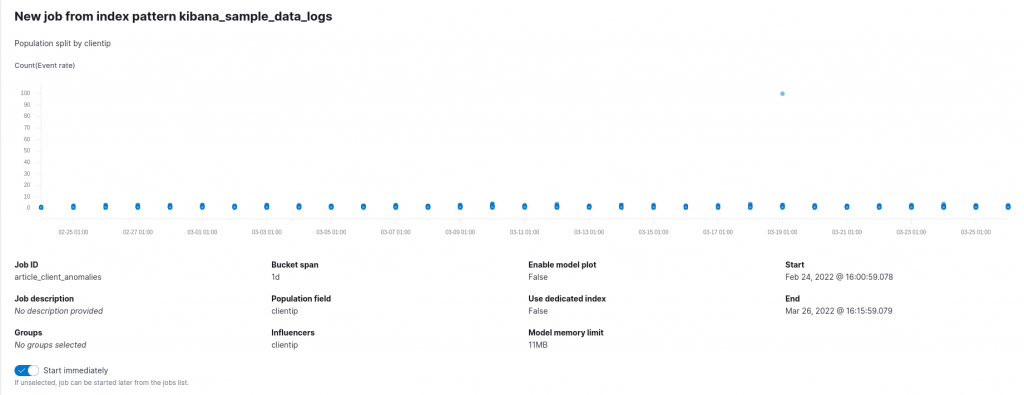
To do so, a second anomaly detection job is needed. This time, we’ll adopt a population job, since this allows us to compare the activity of one client with respect to the others. We can thus select the clientip field as the population field, namely the field responsible for distinguishing between the various individuals in our population. For the target metric and bucket span we can keep the options we’ve already adopted. The configuration of this model might thus look like the following:
Running the previously reported configuration reports the following results:
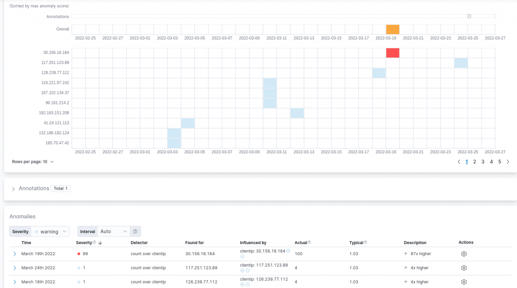
As expected, the large number of requests from the already identified client are recognized to be a clear anomaly with a large score in terms of severity. We can also note that other minor results were reported which were also influenced by the typically low number of requests a single client performed to the domains under consideration each day (on average 1.03). In the considered scenario, such anomalies can be ignored given the low severity assigned to them by the detection job and their modest difference with respect to the usual behavior.
Conclusions
Data are nowadays a fundamental component in the decision process of each organization. In this post, although we concentrated our attention on sample data for simplicity reasons, we analyzed how NetEye, thanks also to the Elasticsearch integration, allows for the effective visualization of the collected data and offers the possibility to employ widely established machine learning techniques to further investigate them, thus extracting core information that may influence your future decisions.
These Solutions are Engineered by Humans
Did you like this article? Does it reflect your skills? We often get interesting questions straight from our customers who need customized solutions. In fact, we’re currently hiring for roles just like this and others here at Würth Phoenix.
Davide Sbetti
Hi! I'm Davide and I'm a Software Developer with the R&D Team in the "IT System & Service Management Solutions" group here at Würth IT Italy. IT has been a passion for me ever since I was a child, and so the direction of my studies was...never in any doubt! Lately, my interests have focused in particular on data science techniques and the training of machine learning models.
Author
Latest posts by Davide Sbetti
30. 06. 2026
AI, Kubernetes
Load-balancing Requests to LLMs in Kubernetes: A KV-cache Approach with llm-d!
30. 03. 2026
APM, Log Management, Log-SIEM, NetEye
Sending OTel Data to Elasticsearch: Tenant Segregation through OAuth