10. 06. 2026
Unified Monitoring

13. 12. 2022
Davide Sbetti
Log-SIEM, Machine Learning
Building a Dashboard in Kibana to Keep Track of Your Smart Ingest Pipeline
In a previous article, we used NetEye and Elasticsearch to train a machine learning model able to classify documents about some collected radar signals, separating them into two categories (good vs bad), starting from an existing dataset. Afterwards, we applied it to new incoming documents using an Ingest Pipeline and the Inference Processor.
Taking as our starting point where we left off last time, let’s continue by creating a simple dashboard to monitor the data ingested by our smart ingest pipeline in order to understand how our model is classifying the incoming documents and the associated probabilities.
Simulating New Documents
Before monitoring the operations of our model, we need to add some documents to our Elasticsearch instance. Since we’re not really collecting radar signals, and our goal is not to evaluate the model’s accuracy but rather to show the creation process behind a visualization, we can index some of the data used during the training phase.
Note: re-using the data used during the training phase to evaluate a machine learning model is NOT a good practice, since it introduces possible biases during the training process that might affect the result of the model, leading to much better performance than could be achieved in real scenarios. However, as noticed above, the goal of this article is to create a useful visualization to show the output of the model for each indexed document, rather than evaluating the model itself.
In order to add some documents to the index we created in the previous article, we can use the following Python script. To be able to run it, please install the pandas library.
The script will upload a sample of the dataset of the specified size to NetEye’s Elasticsearch instance, using our already created index. By default, each document will be indexed at a 15 minute interval, but you can easily adapt the script to your particular needs.
import pandas as pd
import subprocess
import datetime
attributes_max_number = 34
dataset_path = "ionosphere.csv"
sample_size = 20
data = pd.read_csv(dataset_path)
sample = data.sample(n=sample_size)
doc_count = 1
for index, row in sample.iterrows():
# create the put query
put_query = "{"
put_query += '\\"date\\":\\"' \
f'{(datetime.datetime.now() - datetime.timedelta(minutes=15*doc_count)).isoformat()}\\",'
# add all attributes of the document in the required format
for attribute_num in range(1,attributes_max_number + 1):
attribute = f"attribute{attribute_num}"
put_query += f'\\"{attribute}\\":{row[attribute]}'
# close the request query body
if attribute_num < attributes_max_number:
put_query += ","
put_query += "}"
# upload it using the available NetEye script
# upload it using the available NetEye script
try:
out = subprocess.check_output("/usr/share/neteye/"\
"elasticsearch/scripts/es_curl.sh"\
f" -s -XPUT -H 'Content-Type: application/json'"\
f" -d \"{put_query}\""\
f" https://elasticsearch.neteyelocal:9200/"\
f"radar-collected-data-000001/_doc/{doc_count}", shell=True)
print(f"Document {doc_count} send, output: {out}")
except subprocess.CalledProcessError as e:
print(f'Error. Output: {e.output}')
exit(2)
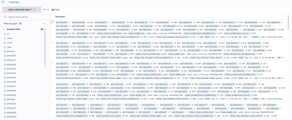
doc_count += 1After the script completes, we can observe the uploaded documents using the Discover functionality of the Kibana interface and the Index Pattern we created previously, as described in the related article.
Good vs. Bad
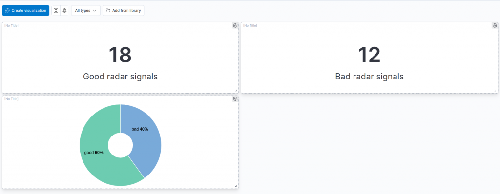
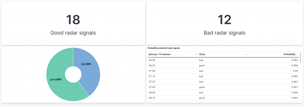
When designing a dashboard related to the application of our classifying pipeline, the first information that we would like to see is how many good or bad radar signals we are indexing, in real time.
Note: In this article let’s suppose that there is a gap of at about 15 minutes between each indexed document.
Let’s start by creating a new dashboard! To do so, in Kibana’s interface just click on Dashboard, under the Analytics section, and then on Create Dashboard.
We can add a new visualization by clicking on the Create visualization button.
Since the first information that we would like to see is the number of good and bad radar signals that we have classified, we can start by adding a simple metric visualization. So let’s select the Metric visualization type from the central dropdown, and then drag and drop the field we are interested in. In our case, this is the class.class_prediction.keyword field, which reports the class returned by the classification model.
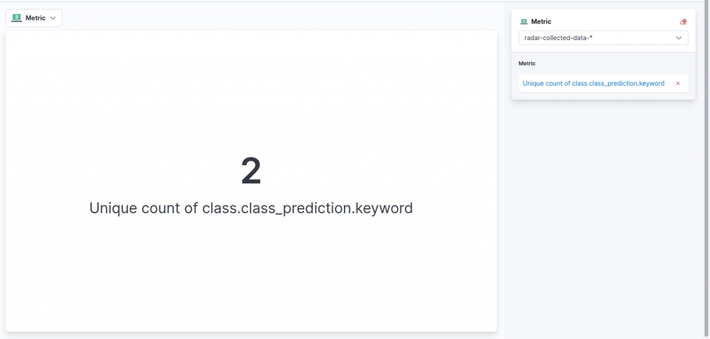
By default, the unique count of the values of the field is returned and surprise, surprise, in our case this is two (who would have guessed that?). To ensure this reflects the count of documents having the good class only, let’s click on the metric on the right menu. From the options menu we can so select Count as the function and then, to keep in the count only the good signals, we can specify the following query under Add advanced options and then Filter By:
class.class_prediction.keyword : "good" After that, we can personalize the label to match the description of the data we are showing, modifying the Display name field. We can then save the visualization and return to the dashboard.
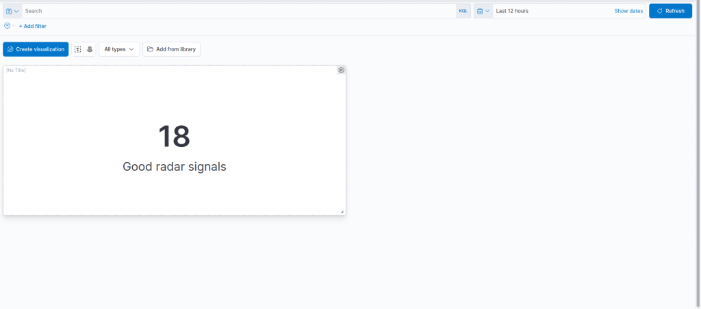
Similarly, we can also create an analogous metric visualization for the bad radar signals, cloning the chart we just created and switching its filter to:
class.class_prediction.keyword : "bad" 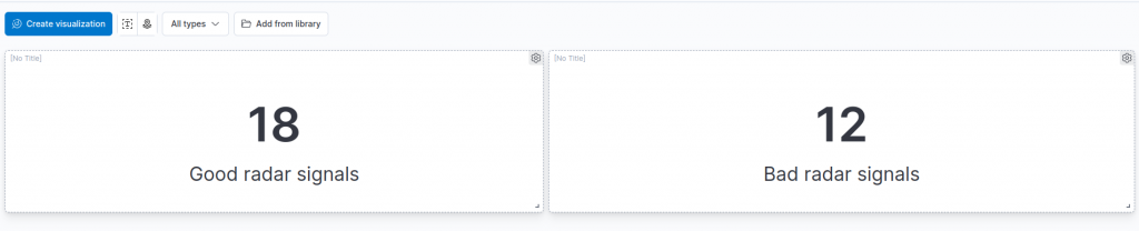
Adding a Do(ugh)nut
We now have an overview of the number of good and bad radar signals that our model has classified. To give it a “touch of color” we can add, right below the two metrics, a “donut” chart to visualize the percentage of good and bad radar signals, not just the total amount in the two categories (yes, we are lazy so we would like to avoid the math of computing the percentages by ourselves).
To do so, we can create a new visualization and choose the Donut format.
After that, we can drag and drop our target field, namely class.class_prediction-keyword, which contains the predicted class as a label. As you can see, Lens already proposes our desired chart, with the count of records in each class represented as a percentage.
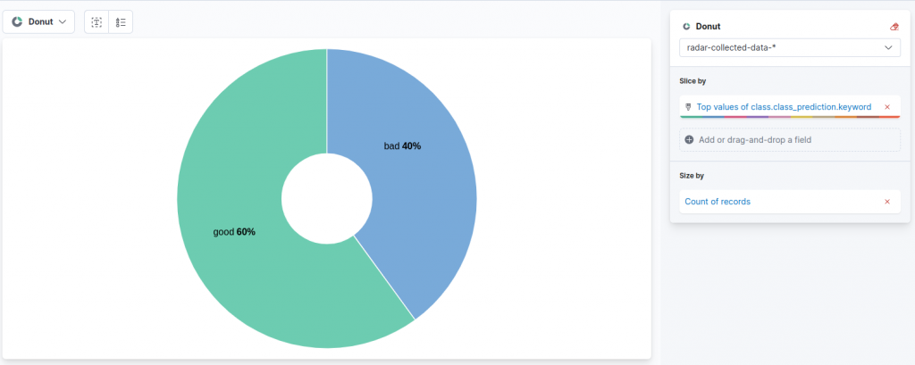
We can save the chart and add it to the second row of our dashboard, arriving at this result:
Probabilities
Until now, we have only visualized the final outcome of the prediction of our model, but wouldn’t it be nice to also visualize the probabilities that our model gives to the various classes, to understand the confidence in the predictions?
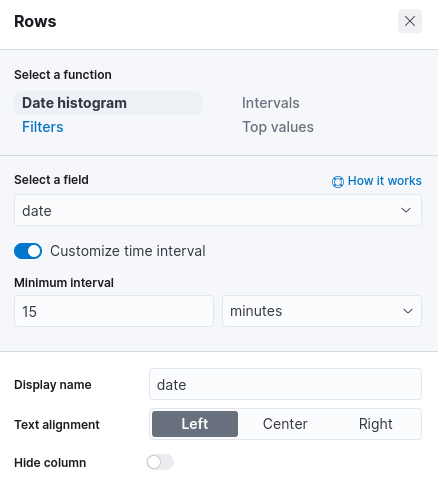
We can add a table to visualize the probability of the predicted class for each document!
This time let’s create a new visualization and select the Table type. In the configuration menu on the right, a click on Rows allows us to choose the criteria used to generate rows. Let’s choose in our case a Date histogram approach, on the date field. Then by clicking on the Customize the time interval toggle, we can set the minimum interval for the data in our table.
In our case, given the frequency at which the satellites process and send data, we are interested in a 15 minute granularity (actually in our Python simulation each document is indexed at about a 15 minute interval. In real case scenarios the interval depends on the indexing condition and must be set after careful analysis).
After having defined the date criteria of our rows, we can add the metrics of the table. Let’s start with the predicted class.
A click on the Metrics section allows us to specify the first metric. As a function, we can select Last value, since in our case there will only be a single document indexed in the set time interval. The field on which we concentrate is the class.class_prediction.keyword, namely the label of the predicted class.
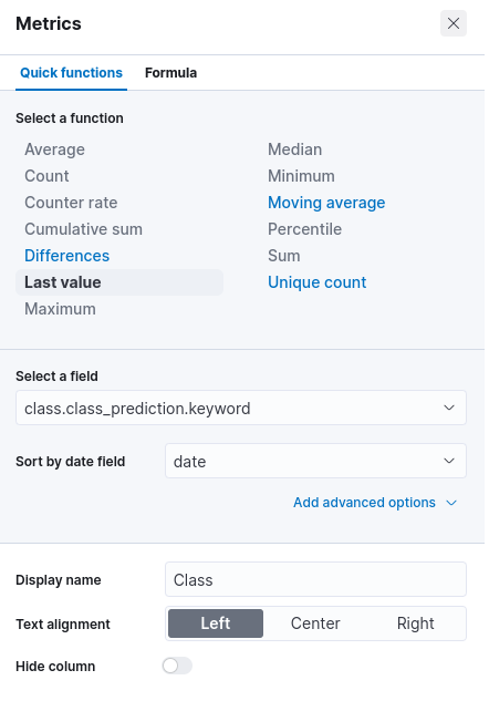
Similarly, we can add a second metric, with the same function, on the class.prediction_probability field, to show the probability of the predicted class.
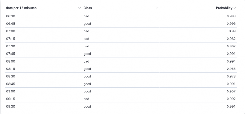
Now let’s save our table chart and place it below the previous visualization, obtaining the following result:
Conclusions
In this article, we completed our journey inside predictive models in Elasticsearch and Kibana, building a simple but effective dashboard to keep track of the results of the model we trained previously and that we are applying using the Inference processor in an Ingest Pipeline. We are thus able to monitor, in real-time, the confidence of our model when making predictions.
References
Ionosphere Data Set: Blake, C., Keogh,E and Merz, C.J. (1998). UCI Repository of machine learning databases [https://archive.ics.uci.edu/ml/index.php]. Irvine, CA: University of California, Department of Information and Computer Science
Dataset
These Solutions are Engineered by Humans
Are you passionate about performance metrics or other modern IT challenges? Do you have the experience to drive solutions like the one above? Our customers often present us with problems that need customized solutions. In fact, we’re currently hiring for roles just like this as well as other roles here at Würth Phoenix.
Davide Sbetti
Hi! I'm Davide and I'm a Software Developer with the R&D Team in the "IT System & Service Management Solutions" group here at Würth IT Italy. IT has been a passion for me ever since I was a child, and so the direction of my studies was...never in any doubt! Lately, my interests have focused in particular on data science techniques and the training of machine learning models.
Author
Latest posts by Davide Sbetti
30. 03. 2026
APM, Log Management, Log-SIEM, NetEye
Sending OTel Data to Elasticsearch: Tenant Segregation through OAuth