

Plotly is a useful and complete open source tool that allow you to compose, edit and share interactive data visualizations. Built atop D3.js, Plotly is one of the most common libraries used for browser-based graphing.
My aim was to create a nice-looking dashboard with four time-based graphs. I was searching for a complete, easy-to-implement and free-to-license JavaScript library. If you have the same requirements, I would very much recommend that you take a look at Plotly.js.
It has a very solid technical base, being built on Python, R, etc. It also has API libraries available across most major languages, although here I want to look specifically at Plotly JavaScript. Below you can find a step-by-step guide to creating a dashboard containing four dynamic graphs based on time series data.
Setup
First of all, download the plotly.js library. Include the plotly-latest.min.js file in your project, for example by including the script in the header like this:
<head>
    <script src="plotly-latest.min.js"></script>
</head>
Before plotting, you need to create an empty container (e.g. a
<div id="graph_container" style="width:500px;height:300px;"></div>
Once the wrapper is ready, you just need to set up the init function for Plotly:
Plotly.plot(containerId, data, layout)
The containerId is a string that represents the ID of the wrapper, the data parameter is an array containing the coordinates of graph points, and the layout is a JSON array containing information for setting up and customizing the graph, such as color, type of graph, title, axis name, …
In my dashboard, I used the following graph layout parameters:
var layout = {
     height: 350,
     paper_bgcolor: '#fff',
     font: {
         family :  'Roboto',
         size   :  12,
         color  :  '#444'
     },
     xaxis: {
         type: "date",
         tickformat: "%X", //to display time formatted as hh:mm:ss
         showline: false,
         autotick: true,
         gridcolor: 'rgb(238, 238, 238)',
         gridwidth: 1,
         showgrid:  true,
         zerolinecolor: '#444',
         zerolinewidth: 1,
         zeroline:  true,
         anchor:    'y1'

     },
     yaxis: {
         autorange: true,
         rangemode: "nonnegative",
         title: containerId,
         titlefont: {
             family :  'Roboto',
             size   :  12,
             color  :  '#444'
         },
         anchor:    'x1'
     },
     hovermode: !1
 };
Pass time-based data
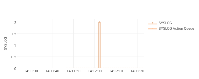
In order to display time-based data series I decided to use “scatter” as the graph type. The colors and format depend on your design guidelines.
var jsonData = {
     x: [time],
     y: JSON['data'],
     name: SYSLOG,
     showlegend:    true,
     cliponaxis:    true,
     fill: 'tozeroy',
     fillcolor: 'rgba(255, 222, 198, 0.5)',
     hoverinfo: 'y',
     hoveron    :  'points',
     type: 'scatter',
     mode: 'lines+markers',
     line: {
         color: '#db9866',
         width: 1,
         dash:  'solid',
         shape: 'hvh',
         simplify: true
     },
     marker: {
         symbol:    'circle',
         opacity    :  1,
         size   :  4,
         color  :  '#db9866',
         line: {
             color  :  '#444',
             width  : 0
         }
     },
     x0:    0
 };
Make it dynamic!
In order to make the graphs slide every second, we have to create a reloadGraph function.
reloadGraph: function($container, series){
     var eventhandler = this;

     if (!eventhandler.interval) {
         eventhandler.interval = setInterval(function () {
                        // if needed you can retrieve refresh data using ajax
             $.ajax({
                 url: "url/dashboard/data",
                 dataType: 'json',
                 async: false,
                 cache: false,
                 success: function (data) {
                     series = updateSeries(series, data); //Format data series
                 }
             });

             var time = new Date(); // Refresh time

             var olderTime = time.setMinutes(time.getMinutes() - 1);
             var futureTime = time.setMinutes(time.getMinutes() + 1);

             // set again axis rage and style          // because after reloading is automatically reset            var minuteView = {
                 xaxis: {
                     type: 'date',
                     tickformat: "%X",
                     range: [olderTime,futureTime]
                 }
             };

             var update = {
                   x: [[time], [time]], //there are two lines in each graph
                   y: series
                 };

                 Plotly.relayout('SYSLOG', minuteView);
                 Plotly.extendTraces('SYSLOG', update, [0,1]);
             }
         }, 1000);
     }
 },
Setup the complete dashboard
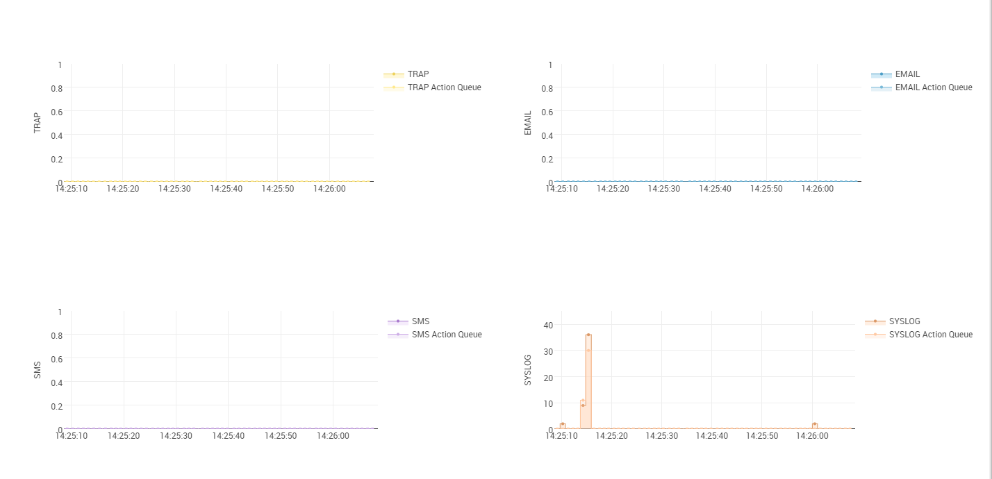
I needed to create a dashboard divided into four different graphs, where each graph should be independent and dynamic.
In order to optimize the code, I decided to work with JSON arrays. For example, I created a useful array for color:
jsonColor = {
         'SYSLOG': {
             'fillcolor': 'rgba(255, 222, 198, 0.5)',
             'lineColor': '#db9866'
         },
         'SYSLOGActionQueue': {
             'fillcolor': 'rgba(255, 201, 163, 0.2)',
             'lineColor': '#FFC9A3'
         },
         'TRAP': {
             'fillcolor': 'rgba(255, 240, 176, 0.5)',
             'lineColor': '#edd15b'
         },
         'TRAPActionQueue': {
             'fillcolor': 'rgba(255, 233, 141, 0.2)',
             'lineColor': '#FFE98D'
         },
         'SMS': {
             'fillcolor': 'rgba(234, 217, 247, 0.5)',
             'lineColor': '#a97ace'
         },
         'SMSActionQueue': {
             'fillcolor': 'rgba(206, 174, 231, 0.2)',
             'lineColor': '#CEAEE7'
         },
         'EMAIL': {
             'fillcolor': 'rgba(163, 213, 237, 0.5)',
             'lineColor': '#4b9dc6'
         },
         'EMAILActionQueue': {
             'fillcolor': 'rgba(120, 185, 216, 0.2)',
             'lineColor': '#78B9D8'
         }
 };
and then I just substitute the color string with the array element inside the data:
fillcolor: jsonColor['SYSLOG']['fillcolor'],
This same procedure can be done for data and titles as well. Also in the reloadGraph I used arrays, which allowed me to update all four graphs simultaneously.
Plotly graphs can be ordered like in my dashboard by creating a structure similar to the following:

I suggest creating a wrapper (<div>), which can help with responsive design. Inside the wrapper you should add a table with two rows containing two cells each. Inside each <td> element you can add the graph wrapper.
Now you just need to customize your dashboard’s style and you’re done!