Statistics and Machine Learning Techniques for RUE
In the age of the cloud the optimization of real end-user experience (RUE) is getting essential for success. On the one hand users expect applications to work faultlessly independent of the time, location, and device one is using them from. Application performance monitoring (APM) is therefore often based on RUE performance metrics. On the other hand, network performance monitoring (NPM) plays an increasing role in the understanding of how an application is working across the network and how potential impacts on the application performance are caused by servers or the network – application-aware network performance monitoring (ANPM). Common goals of APM and NPM are to use performance metrics measured by RUE to ensure user satisfaction by detecting problems as soon as they occur in order to resolve any potential issues before the end-user gets aware of them.
When developing version 1.9 of WÜRTHPHOENIX RUE our focus lied on specific requests and we wanted to simplify the process of finding them. While a very detailed view of as many key performance indicators (KPI) as possible is an important step for getting towards the solution of almost any specific problem, a more abstract, generalized view of network or application performance and end user quality perception might be of advantage at an earlier stage before digging into data. For this reason during the last months we have been dealing with advanced statistics and machine learning techniques that can be used as effective tools to bring registered data to the desired level of abstraction.
Probability Density Functions
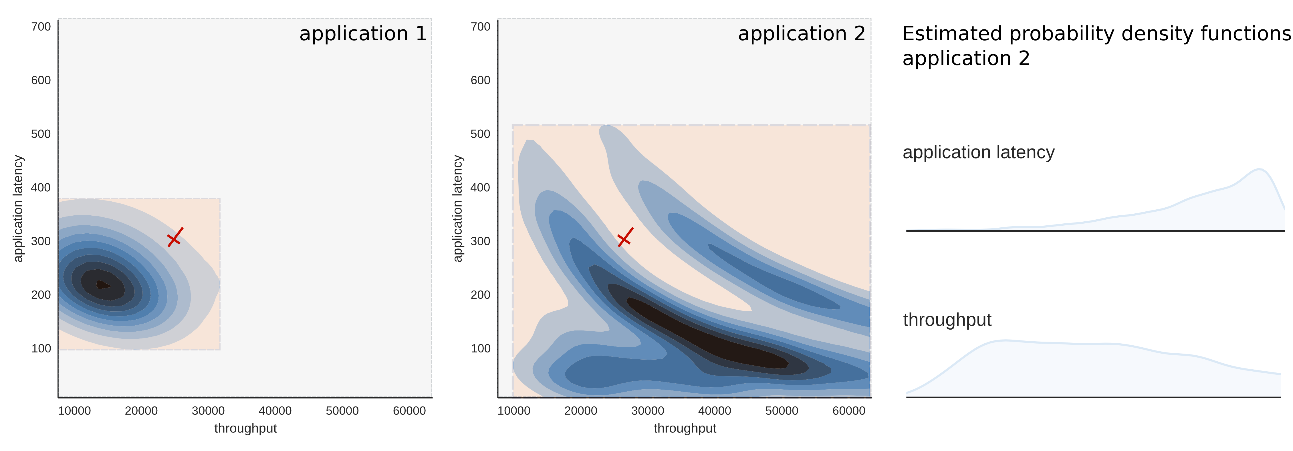
First, we responded to the need of those that currently use WÜRTHPHOENIX RUE monitoring for network or application traffic data with less distinct data distribution. In short we thought of an alternative basis for (critical) warnings whenever query data has not a distinct, single mean. Instead of characterizing standard traffic as “traffic within a certain range of the data mean” we started exploring the data distribution by estimating the probability density function underlying data. The new definition for standard traffic was chosen as “traffic within a certain range of one of the most prominent maxima of the probability density function” (see subnet 1). Especially in cases where the data mean would have fallen into the region between two local maxima (see subnet 2), the quality of warnings can be expected to gain notably. This improvement is bi-directional which means that on the one hand refined baselines avoid standard traffic being falsely considered as “out of range” and on the other hand more realistic ranges improve the warning quality whenever values fall into true non standard regions.
Unsupervised Learning
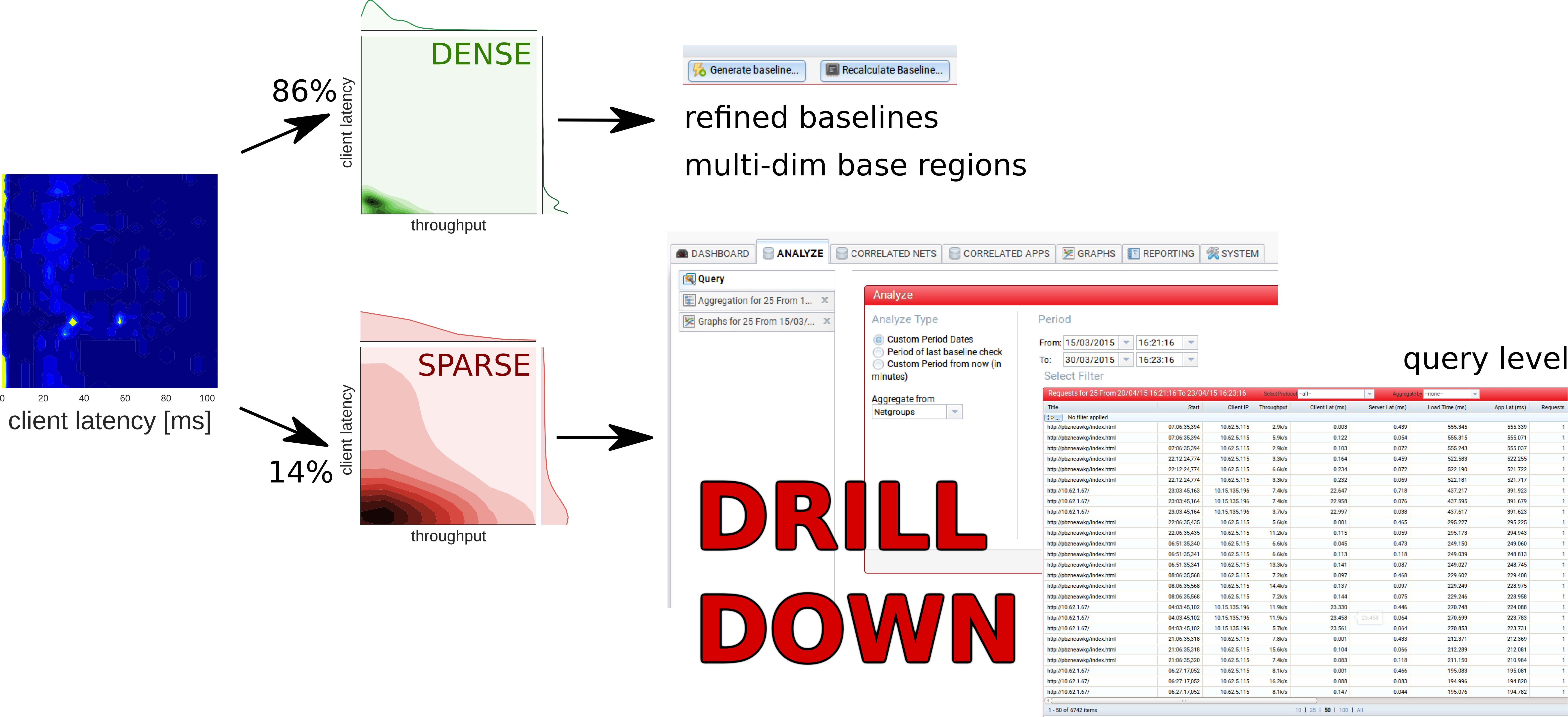
Second, we experimented with unsupervised learning in order to divide network traffic into dense and sparse activity. Unsupervised learning tries to solve the problem of finding hidden structure in unlabeled data. A common approach is grouping data in such a way that data in the same group are more similar to each other than to those in other groups (cluster analysis). In density-based clustering those groups are defined as areas of higher density than the remainder of the data set. Queries during standard performance can be assumed to be closer or more similar than queries from random activity or caused by problems. For this reason a density-based cluster analysis of network data might bring the advantage that normal, standard activity can be separated from irregular traffic.
Similar to baselines multi-dimensional regions of dense traffic can be defined as base regions, while one might want to perform a detailed analysis of sparse traffic regions, especially where a sparse region shows bad values for one or more KPIs. The following example is meant to illustrate the advantage of multi-dimensional base regions: For the sake of simplicity we limit us to two dimensions, namely the application latency and the throughput, as performance metrics.
Application 1 – on the left – has a well defined data range in both dimensions. Warnings based on the mean can be expected to work well for both performance metrics. This is not the case for application 2. There are no distinct, local maxima for the throughput and regions, where activity is expected to be dense, cannot be defined for each single performance metric, but they can be defined via density-based supervised learning algorithms in the multi-dimensional space that contains all performance metrics. For example the light sparse activity region at the center of the density plot of application 2 is surrounded by blue dense activity regions.
Performance Trends
We are working on a new graphical tool that allows us to visualize a high level performance trend (PT) which can be used for both APM and NPM. The PT uses both concepts illustrated above to bring an enormous amount of data to the desired level of abstraction. This way one gains more control about performance at high level and gets useful information for step by step drill downs at the same time. In detail the PT is showing the changes of the estimated probability density function of the query data over time. A PT of dense traffic can be expected to visualize the authentic bigger picture of current performance. Beside the performance monitoring over time of potential performance issues this kind of plotting technique can also be used in a comparative mode in order to evaluate network or application traffic data before and after some kind of intervention.
The interpretation of PT plots is straight forward. Darker colors (see a)) stand for lower query frequency, lighter colors (see b)) indicate higher frequency instead. Wider areas and vertical stripes are caused by constant traffic (see b)). Smaller areas, blobs or dots form whenever network or application traffic is interrupted (see c)).
Concept of Usage
One possible way to use the new advanced statistics and machine learning features is explained in the following. For example there might be some users within a company network complaining about abysmal performance of a specific application during a single working day. A PT plot of the network traffic created by the application of interest during the working day in question might be able to show that there are no anomalies visible at high level beside a few blobs far from standard traffic for the client latency. After a quick sigh of relief one might want to go one step further and apply the density-based unsupervised learning analysis to find out that 86% of the queries of that day are densely concentrated within a small range while 14% of the queries have been detected as sparse traffic. The dense standard traffic might be used as basis for the calculation of new refined baselines or even multi-dimensional base regions. The sparse traffic instead is the one that most probably contains information about the potential problem and those queries responsible for the suspect blobs. For this reason a first dig into data might be restricted to an investigation of sparse traffic e.g. in the form of a drill down to query level. A closer study of the sparse traffic might reveal precious hints about the causes of the non-standard traffic. It is convenient to analyze the 14% of data that is most probably related to potential problems first, as some applications might have tens of thousands of queries a day, making any complete analysis a time-consuming process.
Here you can find more details in the Whitepaper and a Use Case.


