17. 06. 2026
Atlassian

21. 04. 2022
Fabrizio Dovesi
Service Management
“Gonna keep on MONITORING ’til MY TEAM reaches the highest ground” – A Jira Dashboard to monitor Support teams’ performance and service quality level
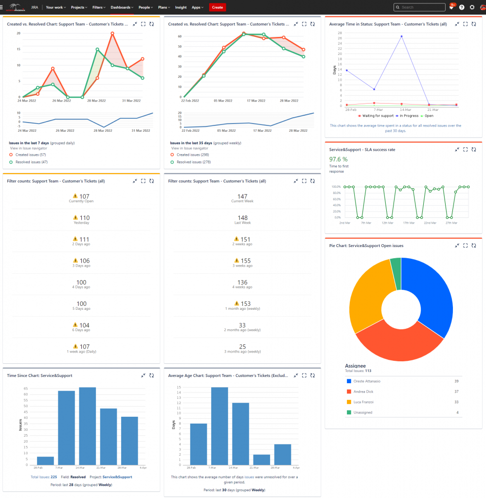
This post aims to drive you in creating a Jira Dashboard, within an existing Jira Service Management Cloud, designed for both Support teams and managers to monitor the number of issues/tickets trends within a given Support project.

After following these simple instructions, in just 10 steps you'll have:
📌 A Dashboard ready to be used by you and your team
📌 A clear understanding of how to build a dashboard
📌 A clear understanding of what some out-of-the-box Jira dashboard gadgets do
Introduction
This title should sound familiar to anyone who loves Stevie Wonder’s music, and it does have the right groove. I’ve got to admit that I stole it from the inimitable American musician and that it was something that got me inspired to write this post, as well.
After listening to the lyrics of the original “Higher ground” song:
"I'm so glad that I know more than I knew then
Gonna keep on tryin'
Till I reach my highest ground"
it came to my mind to adapt them not only for the title, but also to enhance awareness about the recommended mindset you and your team should adopt in regard to monitoring project performance with structured approaches and tools. Since a main goal is to help you constantly grow your team results and consciousness, you will definitively obtain more and more benefits in adopting both Jira and good practices together, compared to just having one more piece of software that only helps with support services.
So first it’s a matter of an “approach to the way-of-work” culture to be spread across your team. This goes through a mix of your team’s best practices, processes, ceremonies, and events including:
- Defining shared KPI and metrics and a way of representing them
- Defining shared goals
- Committing to collecting required data during support activities
- Collecting feedback from others (both internal and external to the team)
- Performing review events and alignment events on a scheduled basis
- Being ready to change quickly
Since many of us may be scared, or even just discouraged, about applying changes to a team’s (or even worse, company’s) culture, I can at least reassure you that Jira represents a “good friend” that makes such an evolution easier than ever.
Before we begin, let’s take a look at the final result of what we want to create with Jira Dashboards, i.e., a taste of what these dashboards do to help us get a clear and shared overview of the Support team’s health status, performance and trends.
In any event, if you want to get more details on available out-of-the box gadgets and related features, you can check out the official Atlassian pages listed below: Use Dashboard Gadgets
Before starting, there are some things you should be aware of:
⚠ The final result you will see within the dashboard gadgets is affected by the quality of data available in your project, and thus what’s going on behind the scenes. Don’t expect great results if your data set is not in line with this, but again we recommend to try to adopt best practices, like the ones mentioned above, to fill the gap.
⚠ Remember to share filters and the dashboard itself to make it visible to the whole team (both dashboard and filters are usually set as private by default)
⚠ Don’t worry if users see different results/numbers of issues than other team members when they log in to the same dashboard. This is expected (and desirable, too) if you have in place issue restrictions, like the issue security scheme, or if a user lacks project permissions. In this event, use the “permission helper” within the Jira administration settings to find out the root cause.
Step-by-step Guide
Now we’re ready to put our hands on dashboards, so let’s start!
STEP 1 – Log in to your Jira account and create a new dashboard
First of all, sign in to your Atlassian account from Atlassian’s Login page and go to your Jira site .
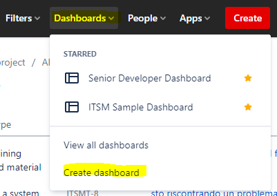
From the Jira Main Navigation Bar, click on “Dashboards” and then on “Create dashboard“
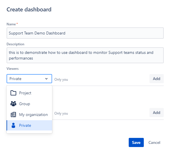
Give a Name to the Dashboard and, eventually, add people as either a dashboard viewer or editor to share it with them (this is something that you can do later, once the dashboard has been completed). Finally, click on “Save”
STEP 2 – Prepare your filters
In order to get everything ready for the dashboard’s setup, we must create some filters to be used later during gadget configuration.
In this example we are first going to create3 filters; each of them has a specific purpose that will become clearer once we apply them to the respective gadget.
- All Customer’s Support requests – all the issues related to the Support project, excluding the internal ones (like task, subtask, etc..):
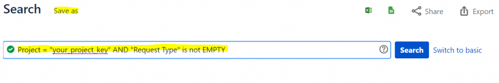
- Project = “your_project_key” AND “Request Type” is not EMPTY
- All Open Customer’s Support requests – all the issues related to the Support project, excluding the internal ones (like task, subtask, etc..) and those already resolved:
- Project = “your_project_key” AND “Request Type” is not EMPTY AND resolution is EMPTY
- All Customer’s Support requests (Excluding issues that were in “Pending” or “Waiting for Customer”) – all the issues related to the Support project, excluding the internal ones (like task, subtask, etc..) and the ones that have been in “Pending” or “Waiting for Customer” in their history:
- Project = “your_project_key” AND “Request Type” is not EMPTY AND status was not in (Pending, “Waiting for customer”)
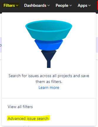
To create a filter you can click on “Filters” in the Jira main navigation bar and then on “Advanced issue search”.
For each filter, you can copy/paste the JQL listed above into the “advanced search bar” and then click on “Save as” button (see following picture)
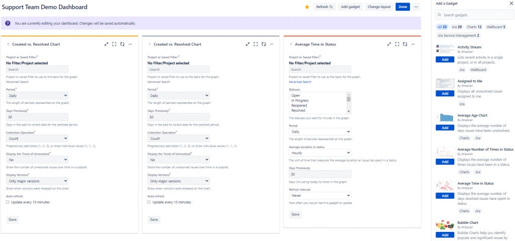
STEP 3 – Set board layout to the dashboard and add a gadget
Let’s go back to your dashboard now (by clicking on “dashboard” from the main navigation bar, again).
To obtain the same dashboard view shown in the Introduction, you should switch to the “3 columns” layout, so click on “Change layout” at the top right and select the one with 3 columns as shown in the following picture.
Then you can add a gadget to your dashboard by clicking on “Add” on the ones available from the dedicated menu to the right.
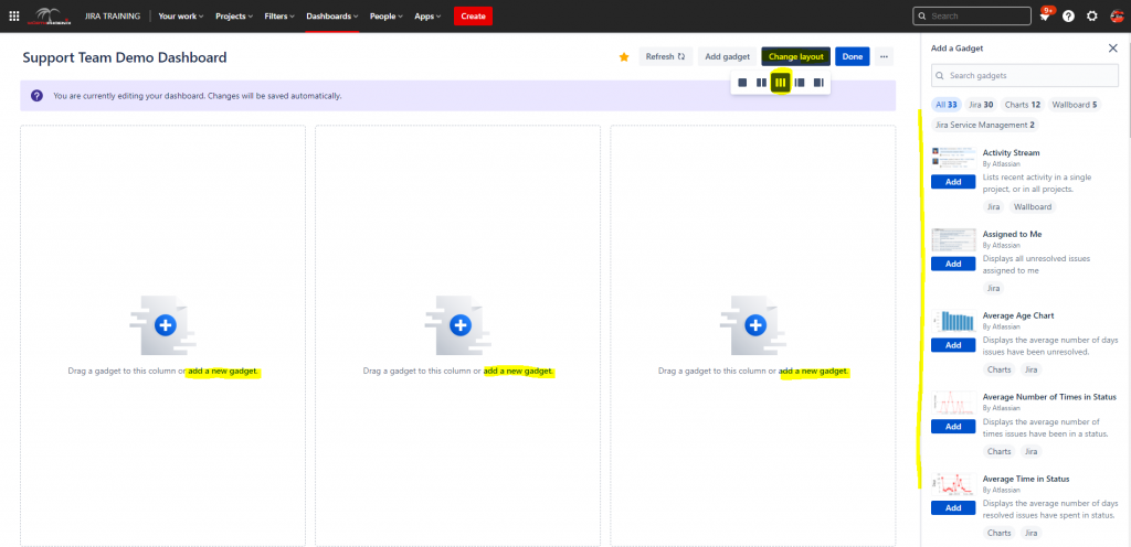
To begin, select the “Created vs. Resolved one” twice and the dashboard should appear as in the following picture. If it’s not, just drag and drop the two “created vs. resolved” gadgets until you have positioned them in the proper place: one in the first column and the other in the center one.
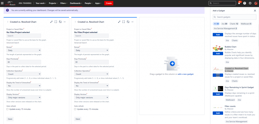
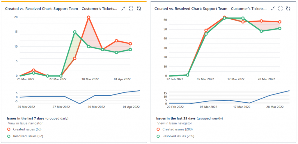
STEP 4 – Created vs Resolved gadget
This gives you an easy way to look at the trend of issues created compared to those resolved; in this example our focus is just on customer support requests, so we must use one of the filters created before in the configuration to define the proper perimeter. These two gadgets will respectively guarantee us a perception at first sight of the performance of last week’s “created vs. resolved” tickets (by day, to focus on the current state) and those of last month (by week, for an overview with data more stable and legible than the daily ones)
So next, select the filter All Customer’s Support requests on both of the gadgets.
On the one to the left, set these values:
- Period: Daily
- Days Prev. : 7
- Cumul. Oper. : Count
- Display the Trend …: Yes
- Display Version: *just if you use them, in the other cases set None
And on the one to the right set:
- Period: Weekly
- Days Prev. :
35 - Cumul. Oper. : Count
- Display the Trend …: Yes
- Display Version: *just if you use them, in the other cases set None
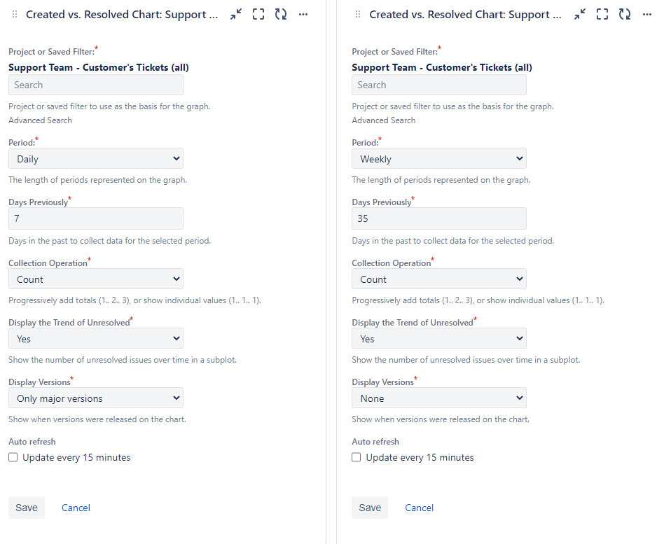
Finally, after clicking on “Save” you should see something like this:
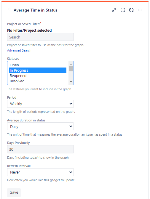
STEP 5 – Average Time in Status gadget
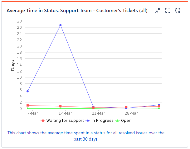
You can now add a new gadget, the “Average Time in Status”. This gadget aims to display the average number of days/hours that issues have spent in a specific status, or even multiple statuses (this can be easily defined by the user directly from the gadget configuration panel). This will help the team to focus on the average time spent by agents to “escape” from the most critical statuses, like the “waiting” for team actions or the “in progress” ones.
Next, set the All Customer’s Support requests filter in the “project or saved filter” field.
You should then set:
- Statuses:
- In progress
- Waiting on Support
- (another optional status if needed)
- Period: Weekly
- Average duration: Daily
- Days Prev. : 30
After clicking on “Save”, the final result should appear similar to the following:
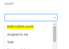
STEP 6 – Filter Counts gadget
You can now add a new gadget, the “Filter Counts“, that let users define criteria and see how many issues in a filter meet it in order to track your and your team’s workload. In this example, we’re going to use it to count the number of open customers’ tickets both per day and per week.
First of all, add 2 Filters counts gadgets to the dashboard and place them under the “created vs. resolved” charts added earlier and set the All Customer’s Support requests filter on both of them.
Then you can add multiple “Build custom count” from the select list menu as shown in the following screenshot to create your gadgets:
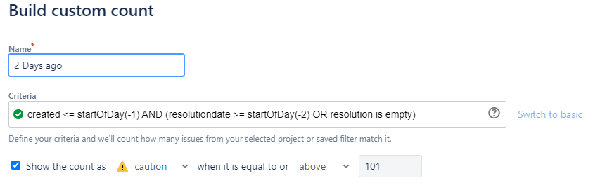
For the Daily filter counts gadget you can set the JQL as follows:
- created <= startOfDay(-1) AND (resolutiondate >= startOfDay(-2) OR resolution is empty)
to find out the number of issues that were open on a specific Day.
Indeed, for the Weekly filter counts gadget you can set the JQL like this:
- created <= startOfWeek(-1) AND (resolutiondate >= startOfWeek(-2) OR resolution is empty)
to find out the number of issues that were open on a specific Week.
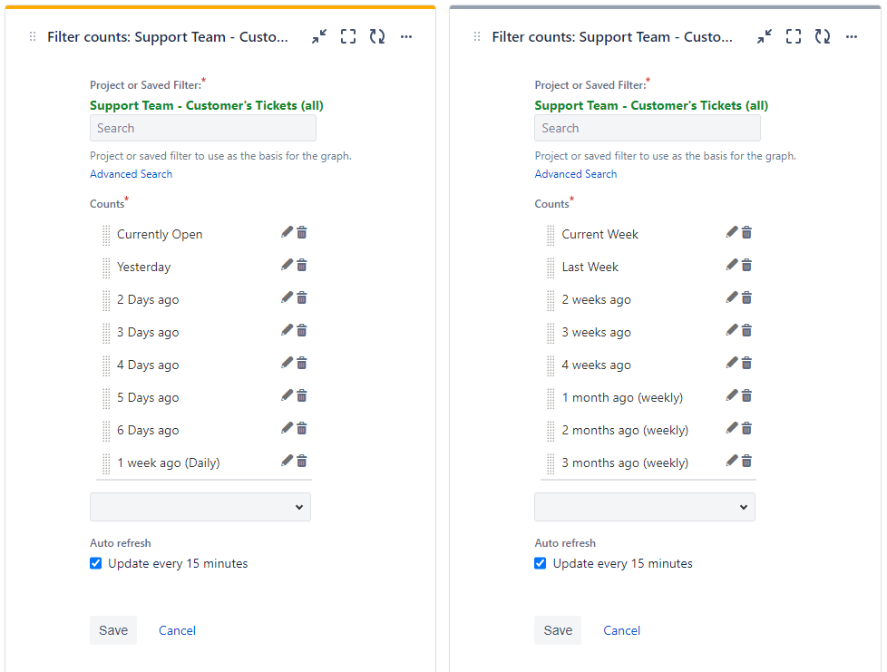
Thus the build custom counts JQLs behind each day or week will look something like this:
Filter counts – Daily
- Currently Open -> JQL: resolution is empty
- Yesterday -> JQL: created <= startOfDay() AND (resolutiondate >= startOfDay(-1) OR resolution is empty)
- 2 Days ago -> JQL: created <= startOfDay(-1) AND (resolutiondate >= startOfDay(-2) OR resolution is empty)
- and so on…
Filter counts – Weekly
- Current Week -> JQL: resolutiondate >= startOfWeek() OR resolution is empty
- Last Week -> JQL: created <= startOfWeek() AND (resolutiondate >= startOfWeek(-1) OR resolution is empty)
- 2 weeks ago -> JQL: created <= startOfWeek(-1) AND (resolutiondate >= startOfWeek(-2) OR resolution is empty)
- and so on…
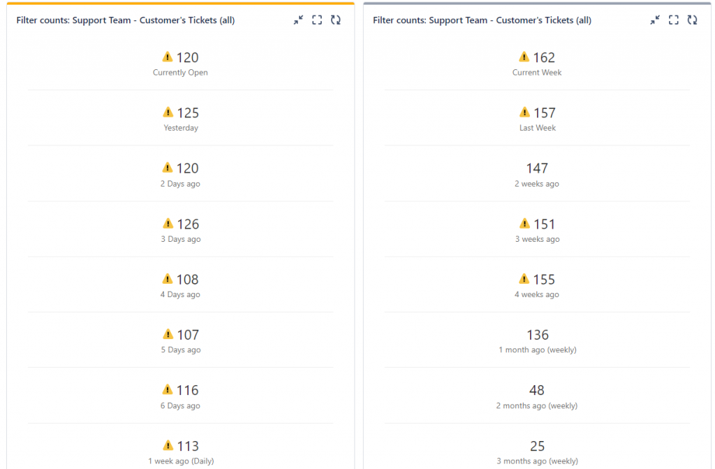
When you click on Save, you should obtain something like this:
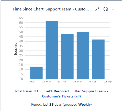
STEP 7 – Time Since Chart gadget
You can now add another gadget to the dashboard: the “time since chart”. It displays the time since a field was chosen for each issue for a project or saved filter. In this example, we are going to use the Resolution field to count the number of issues resolved per week. This will show the team their effectiveness in producing “output” constantly and let them easily compare it to those reported the weeks before.
To do this set the All Customer’s Support requests filter into the “project or saved filter” field.
Then, you should set:
- Date field: Resolved
- Period: Weekly
- Days prev.: 28
- Cumulative totals: No
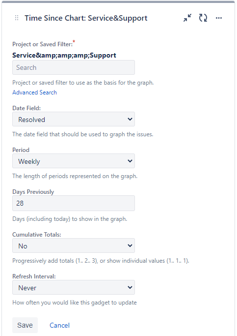
By clicking on “Save” the final result should appear similar to the following:
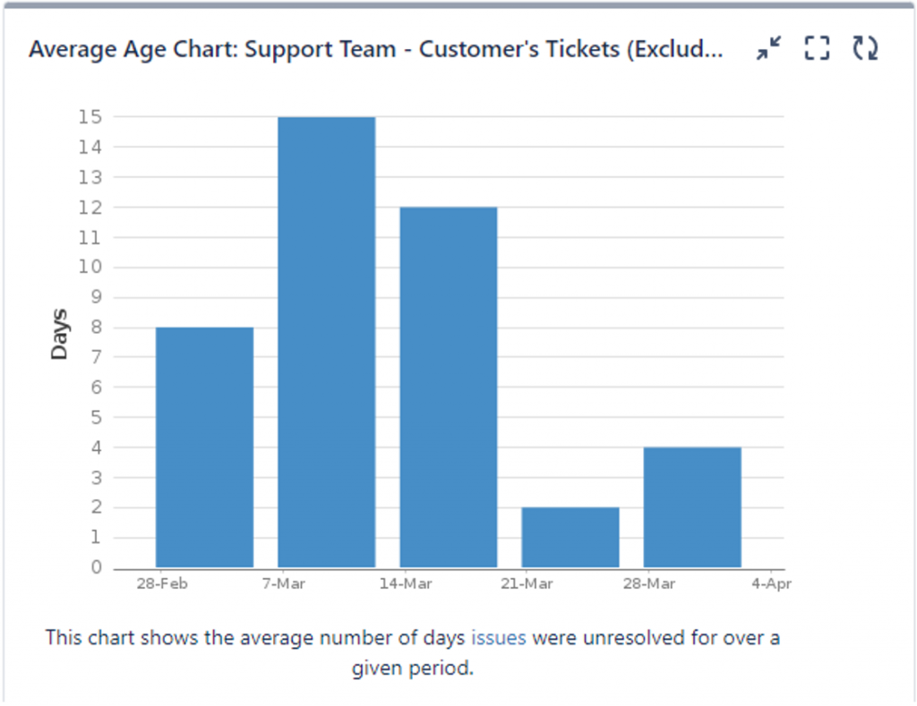
STEP 8 – Average Age Chart gadget
You can now add another gadget: the “Average Age chart”. It displays a bar chart of the average number of days that issues have been unresolved per week. This will show the team how long it takes them on average to resolve customers’ tickets (by excluding the ones that have been transitioned from those statuses where the “waiting time” is not the team’s “fault”, like “pending” or “waiting for customers”) and to easily compare it to the past weeks’ data, and thus analyze the trend.
Here set the All Customer’s Support requests (Excluded issues that was in “Pending” or “Waiting for Customer”) filter in the “project or saved filter” field.
Then, you should set:
- Period: Weekly
- Days prev.: 28
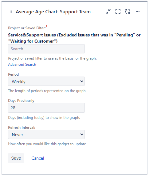
By clicking on “Save” the final result should appear similar to the following:
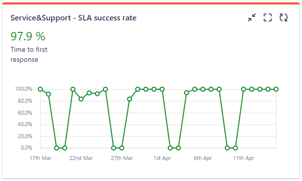
STEP 9 – SLA Success Rate gadget
You can now add another gadget to the dashboard: the “SLA Success Rate”. It displays the rate at which your team is meeting a specific SLA. In this example, we’re going to focus on the “Time to first response” of the support team. The gadget it is designed to help the team in being committed to the same shared goals and to act/think like a real team to prevent breached SLAs in the project. This gadget is only based on service projects’ existing reports, so it’s not possible to set a filter on this one.
Set the Service Support project in the “Service project” field.
Then you should set:
- Report: SLA success rate
- Days range: Past 30 days
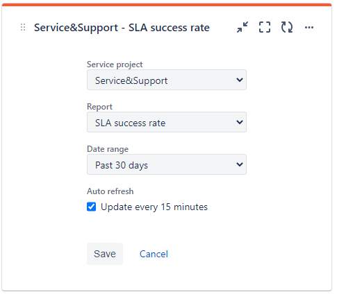
After clicking on “Save” the final result should appear similar to the following:
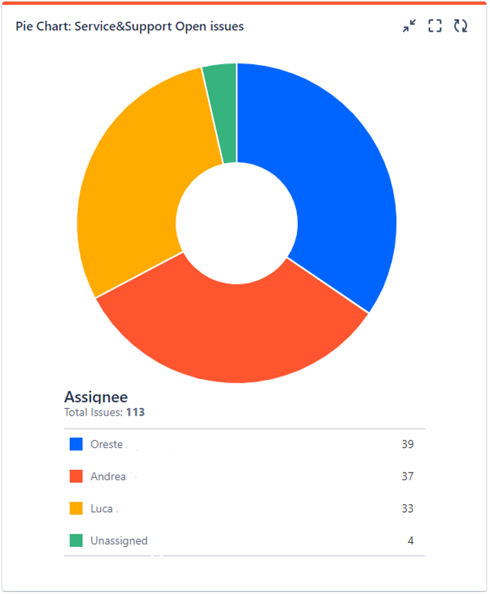
STEP 10 – Pie Chart gadget
You can now add another gadget to the dashboard: the “Pie Chart”. It displays issues from a project or issue filter, grouped by a statistic type, in pie chart format. Issues can be grouped by any statistic type (e.g. Status, Priority, Assignee, etc.) In this example, we’re going to configure it to show ticket assignation across agents. It will thus help the team in individuating who has a higher workload than others.
Set the All Open Customer’s Support requests filter in the “project or saved filter” field.
Then you should set:
- Statistics type: Assignee
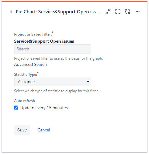
After clicking on “Save” the final result should appear similar to the following:
Conclusion
Congrats!!! You’ve just provided yourself and your team with an easy, fast and interactive way to be on the same page for controlling the Support team’s tickets trends with Jira Dashboards!
To conclude, please remember that you will only get a “working solution” by putting together all the pieces mentioned above in the introduction! That is to say that in case the team discovers something wrong about its performance/trends by analyzing data on their Jira dashboard, it should be taken as a real “Alert” and the team must then face the problem and react accordingly to find a solution! So remember that tools are helpful only if they are then followed by team actions (or better, “re-actions”) aimed at both improving team performance and service level (thereby avoiding a “passive” monitoring approach that might cause the opposite effect and turn the team dashboard into a tool the team never uses, making them “orphans” again in a shared and common goals interactive view).
As Stevie Wonder would say “Teams, Keep on monitoring….’Cause it won’t be too long!“…and hey, why shouldn’t you take a few minutes to get inspired by him, too!
Stay tuned and see you in my next episode! 😉
These Solutions are Engineered by Humans
Are you passionate about performance metrics or other modern IT challenges? Do you have the experience to drive solutions like the one above? Our customers often present us with problems that need customized solutions. In fact, we’re currently hiring for roles like this as well as other roles here at Würth Phoenix.
Author
Latest posts by Fabrizio Dovesi
31. 03. 2026
Atlassian, Service Management
When Agile at Scale Meets Atlassian: Choosing the Right Scaling Model for Global IT Organizations
30. 12. 2025
Atlassian, Service Management
Atlassian Rovo Today: Architecture, Technologies, and Enterprise Trust
01. 10. 2025
Atlassian, Service Management
Project Managers Are rAIsing the Bar: Redefining the Rules of the AI Game
30. 06. 2025
Atlassian, Service Management
Where ITIL® 4 Meets Atlassian: Elevating IT Service Management
21. 03. 2025
Atlassian, Service Management
Be a “Whiteboard Blackbelt” to Unleash Effective Collaboration