18. 03. 2025
Icinga Web 2, ITOA, NetEye, UI, Unified Monitoring

Grafana is an open source data visualization application that is widely used for displaying interactive monitoring and service dashboards. It focuses on a high-performance visualization of time series data, such as network throughput, access time, or CPU performance data. For this, it connects to specific time series databases such as InfluxDB, but also to common relational databases, such as MySQL and MSSQL.
Beyond plain time series however, you often need to also display diagrams with daily or monthly KPIs. In IT Operations you might need the monthly availability or the daily average network speed, while in service management you have e.g. the number of tickets by day or the monthly average of solution times.
Of course, even non time-related diagrams can be interesting. In other applications, or just in Excel with pivot tables and stacked bar charts, you’ll get a quick win for such reports. In Grafana it’s a bit trickier to group data by time intervals and to display multiple result sets, but it’s worth trying. Let’s try with some diagrams based on MySQL data from a servicedesk application!
“Old” Graphs
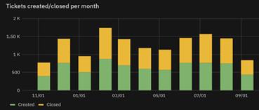
I’ll start with the time series graph in Grafana 7, called “Graph (old)” in Grafana 8. To display e.g. created and closed tickets per month, you need to define multiple queries, each one for a result set. By default, the results are displayed in the same position and thus the smaller bars are hidden. Simply select the option for diagram stacking and you get this result, which is not bad. But it’s difficult to compare values:
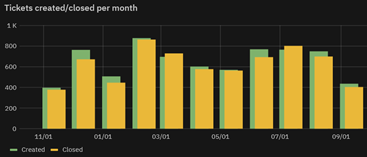
With various tricks you can get a more dynamic visualization, similar to grouped bar charts or old school “3D” diagrams in Excel. Just translate the second query by some days (or hours if you use a grouping by day), e.g.:
Query A: SELECT LAST_DAY(create_time) as time, count(*) as value FROM …
Query B: SELECT LAST_DAY(create_time)+INTERVAL 5 DAY as time, count(*) as value FROM …
Grafana 8 “New” Graphs
However, Grafana 8 contains a completely new time series graphing module which is not at all compatible with the preceding one. Sadly, it’s no longer possible to stack data from different queries. Grafana now stacks the data of the additional rows extracted by a single query!
This can be easy if your data is already formatted this way, for example with a log of processor data you’ll get a classic processor time view, that sums to 100%.
SELECT date, idle-time, kernel-time, user-time FROM processor_data;If you have to aggregate the data, it can be more cumbersome: you need to define each row with a sub-query or alternatively, as in this example, by using CASE statements:
SELECT
  DATE(t.create_time) as time_sec, -- not displayed
  CONCAT("Agent", ' ', user_id) as metric,
  SUM(CASE WHEN YEAR(t.create_time)<= 2020 THEN 1 ELSE 0 END) as "<=2020",
  SUM(CASE WHEN YEAR(t.create_time) = 2021 THEN 1 ELSE 0 END) as "2021",
  SUM(CASE WHEN YEAR(t.create_time) = 2022 THEN 1 ELSE 0 END) as "2022",
FROM ticket t JOIN ...
GROUP BY user_id;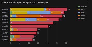

As you can see, these stacked diagrams cannot however display a dynamic grouping of the results, as is possible with Excel Pivot tables or with SQL GROUP-BY statements – in this case we would expect a group for every different year in the result set. If you want to display the data of several years or of several states, you need to hard-code a query (Grafana 7) or a result row (Grafana 8) for every year!
Let’s hope that this feature will be implemented in Grafana for relational databases in upcoming versions.
Ways to Group Data by Month in Grafana
KPI data often needs to be grouped by week, month, year, etc. Grafana provides the $__timeGroupAlias macro for this – you just provide the grouping interval, e.g. 1d, 1M, 1Y. But pay attention, this doesn’t quite work as intended! It simply groups by 24h, by 30 days or by 356 days, counting backwards from the actual date. Even looking at the diagram for New Year’s Eve, the graphs wouldn’t be correct, since it doesn’t take into consideration either months with 31 days or leap years.
SELECT $__timeGroupAlias(t.create_time,1M),
  SUM(CASE WHEN ticket_state_id IN (1,4,6) THEN 0 ELSE 1 END) AS "Closed",
  SUM(CASE WHEN ticket_state_id IN (1,4,6) THEN 1 ELSE 0 END) AS "Open"
FROM ticket t
GROUP BY time ORDER BY time;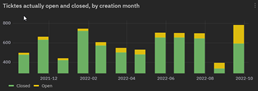
Thus you need to use the DB’s native date functions. An easy way to group by month is:
SELECT LAST_DAY(t.create_time) as timewhich returns the last day of the month for every timestamp, but in Grafana the bars are displayed in the following month. If you like to display the bars starting from the first day of the month you can use:
SELECT DATE(DATE_SUB(create_time,INTERVAL DAYOFMONTH(create_time)- 1 DAY)) as timeThese are just some tips and workarounds to display KPIs as bar charts from MySQL-DBs in Grafana. So now that you have some basis to play around, make your boss happy with astonishing Grafana dashboards!
These Solutions are Engineered by Humans
Are you passionate about performance metrics or other modern IT challenges? Do you have the experience to drive solutions like the one above? Our customers often present us with problems that need customized solutions. In fact, we’re currently hiring for roles just like this as well as other roles here at Würth Phoenix.
Mirko Morandini
Mirko Morandini, PhD, is a senior consultant in IT Service Management and Asset Management, with over a decade of experience and numerous successful projects in Germany, Austria and Italy. As the GLPI advocate at Würth IT Italy, Mirko is passionate about open source solutions - and when he’s not optimizing IT processes, he enjoys spending time with his family and playing and conducting wind band music.
Author
Latest posts by Mirko Morandini
31. 03. 2026
Asset Management, GLPI, Service Management
GROUP-based Asset Permissions in GLPI 11: GLPI Rights Management Redefined
29. 09. 2025
Asset Management, GLPI, Knowledge Management, Service Management
Getting the M(u)st out of GLPI
30. 06. 2025
Asset Management, Unified Monitoring
Das neue GLPI 11 – offizielle deutsche Vorstellung [DE]
31. 03. 2025
Asset Management, GLPI, Knowledge Management, NetEye
GLPI: Automated Inventory Without Using GLPI Agents